Just fuckin’ eat whatever, mate.

“Just fuckin’ eat whatever, mate.”

I like Ben. He’s always moving. Usually forwards, 10 things firing at once in his mind. Mercurial, gifted, and humble. Meet Ben Bayly.

Today I’m at The Grove. A little out the way despite being in the middle of Auckland’s CBD, The Grove is a smart, cozy, classy venue that seats about 80 people in understated luxury.

To just say “food” would be over-simplifying. This is like modern art. This is next level cuisine. I mentioned to Chef that this looks more like sculptural forms than food. He’s probably used to that.

Here’s what it looks like:


Grove SMALL WEB-4 Grove SMALL WEB-9 Grove SMALL WEB-14 Grove SMALL WEB-17 Grove SMALL WEB-19 Grove SMALL WEB-29 Grove SMALL WEB-33 Grove SMALL WEB-41 Grove SMALL WEB-45 Grove SMALL WEB-51 Grove SMALL WEB-56 Grove SMALL WEB-79 Grove SMALL WEB-85 Grove SMALL WEB-88 Grove SMALL WEB-90 Grove SMALL WEB-98 Grove SMALL WEB-111


This is much easier than trying to talk about lighting for 400 words. This is the setup for the majority of the dishes.


Grove SMALL WEB-114 Grove SMALL WEB-128 Grove SMALL WEB-141


Ben Bayly:

Grove SMALL WEB-151


Josh:Grove SMALL WEB-165


Book your table at https://www.thegroverestaurant.co.nz/


And book your shoot at info@tezmphoto.com

Forgotten Lockett & Tez Mercer Photo: Shooting fashion in an unfashionable place

Forgotten Lockett.


Forgotten Lockett (FL): a fashion label based in Auckland, New Zealand. Everything is designed, made, finished, modeled and shipped by one unstoppable lady: Nicole. Say hello, everybody.


Nicole blog-5


She’s a total inspiration.

FL as you’ll see specialise in alternative fashions. Grungy, bold, vivid, alluring, and it’s all one-off stuff. Real cool and encouraging that there’s people out there blazing their own trail and kicking mountains of ass along the way.

So what’s my job here as the photographer?


  • Make the outfits look great
  • Make the model look great
  • Present both in a way that is eye-catching and on-brand.


Now that I see it written down, that’s pretty much the MO for every shoot but, drilling down into it and researching the brand you get a clearer idea of what is “on-brand” for this particular brand and why the same approach probably wouldn’t work for Armani or Davidoff as what would for FL.


So with that in mind and homework done (by perusing the etsy page, website, IG and other social profiles) there was a bit of a gameplan about the ‘look’. As I’ve mentioned before, it’s way easier to know where you’re going if you have a direction to go in. I think backwards. Start with the end, then figure out what steps to take to get to that point.


The wardrobe was obviously going to be handled by FL. My job is location, lighting, settings, and a little bit of discussion/direction about what I’m thinking would work well and why I’m thinking it – this last point usually comes down to walking around a space you think is cool and looking for 3 or 4 distinctive locations you can use within the overall space. For this shoot in particular, which took place in an old metal workshop, I used the main shop floor for 90% of it, but earmarked 5 locations that would combine well with different outfits.

I took a few test shots, checked where the natural light was coming in, what colours are present in the scene and made some notes.


Given the subject matter and style of outfits bright poppy colours wouldn’t do. I wanted industrial, gritty, scratched up, muted shades of olive and brown and tarnished worktops scarred through decades of use.

I guess this is visualisation. It’s kinda thinking through the job before you begin, get your workflow together, try and imagine where the light(s) should go and what shadows and shapes would that make? Do you need 1 light? 2 or more lights? Now’s the time to figure that out – not when the client walks through the door and you need to spend 20 minutes looking into corners and holding the ‘L frames’ in front of your face scoping out angles.
Key light was an octabox up high. Fill light if required was a softbox, a bare light, sunlight, or a combination of all of the above. I wanted an angular light to provide huge shadows so the main light was a bit more around the subject than I would typically do for a corporate gig or something a bit brighter, it wasn’t quite 90 degrees but you can see by the shadows around the nose that it was a pretty acute angle. Sometimes that’s good, sometimes it’s not so good, just move the light until you think it looks cool. You’re the judge here. Trust yourself.


Remember, you can make anything look badass with a light in the right place.

That sentence might encapsulate 10 years of doing this. Funny how it goes sometimes.

And here’s the images:

Nicole blog-11


Nicole blog-7


Nicole blog-14


Nicole blog-17


Nicole blog-2


Nicole blog-9


Nicole blog-24


Editing these shots wasn’t that involved. The model already had great skin, the wwardrobe was taken care of, my lighting was right in camera, so editing was primarily global adjustments in LKR using curves (see below) and white balance to tone it a bit colder and bring some rich density into the midtones. I try and avoid pure black and pure whites in my shots where possible- they’re useless as they contain no detail, just black or white. They’re in there somewhere but it’s totally possible to make things look bright or dark without muddying it up or overexposing everything.

One thing I always do when I think I’m done with a shot is push ctrl+shift+L for auto levels. Do this on a duplicate layer. If you like it, then you’re all set, but if you don’t and you think it changes your colours too much, then set this duplcaite layer to ‘luminosity’ and it will only affect the lightness values and not the colour. This all your hard grading work is left intact but you get the full range from black – white. And I say this only as a “hey, this might help”, I ignore the auto-levels all the time because I’m happy with the look but if you need it, it’s there.

Curves and their curviness.

I mentioned something about using the curves function to change the colours of an image. I stumbled across this accidentally; Canon sensors tend to have quite red shadows which, to me, looks a little too warm. For shoots like this I want cold which is blue, cyan, teal, pale colours. So, open your curves command with ctrl+m, select the red channel from the drop down, grab the very very darkest point (usually bottom left corner) and drag it along the bottom edge towards the right corner. Move it just a little bit until the 0 becomes an 8 or 9. This is tinting the red in the dark regions towards blue, so the shadows will become less red and more blue, and therefore colder looking. Easy right?

For this setup it was my tried-and-tested unbeatable formula for almost any occasion from corporate to portrait to fashion to music to product: big octabox/light source in the back and a softbox around the front at roughly 45 degrees and pretty high. Aim for an f/8 exposure and the background to be JUST blown out into white. If you nuke the back it just overpowers everything and goes crazy, you just want a slight wraparound to the subject and it to look like a white cyc wall in a studio. Easy peasy. Then it’s up to you, and the subject, to understand how it looks and then roll with it. Good models (like Nicole) will change position after every click but it helps to ask the subject to just move their head a little, look around the frame and around the camera after every click. Right down the barrel, over the camera, look to the side, narrow your eyes, adjust your jacket, whatever, just subtle movements can make a big difference to the end product and help this from looking too ‘passporty’.

Nicole blog-32


Nicole blog-38


Nicole blog-36


Nicole blog-34


Nicole blog-35


Nicole blog-33


Nicole blog-41


You can use a white umbrella in the back, a softbox, and any modifier you like ‘out front’ (a beauty dish looks especially cool). It’s a pretty sweet lighting system that you can use on a whole host of subjects and genres.

I think that’s about it. Take-home facts:

  1. Trust yourself.

  2. One light can change everything.

  3. Do all your experimental editing on a different layer.

  4. Drink tea.

  5. Hug dogs.

  6. Call your grandma.

    That’s about it.


Until next time.

Stuntmen are badasses

Sometimes you meet some interesting people.

Once upon a time I was shooting production stills for a short movie called Just 3 Girls. While shooting on set I met a guy called Mana Hira Davis – you’ve seen him before, you just didn’t know it was him – he’s a stuntman doing films around the world, jumping out of buildings, being set on fire, no big deal, the usual stuff. We got talking about doing a photo shoot of sorts with no real plan in mind just something involving tactical gear, firearms, badass facial expressions with a vaguely paramilitary air.

These guys go all out. It’s 100% all the time. If they’re asked to take cover behind a wall of tyres, they don’t stroll over then crouch down. They run full tilt like they’re dodging bullets, yell for suppressing fire, then slam into the tyres and bring their weapon around to bear. It’s amazing to watch and shows the chasm that exists between the real-life working pros and the play actors phoning it in.

Humourous Interlude: The 3 guys met me outside the office. Mana asks me what kind of gun I’m looking for in the shoot. “Something big” I replied. “How big?” he asks, while opening the boot of his blacked out Subaru. “The biggest you got” I say, because really, that’s the only answer.

The boot swings open – and this is on a pretty busy street at 5pm so everybody is leaving work and driving past – and there’s a stack of guns in there, shiny, black, oiled, maintained. These aren’t water pistols, they’re legit replica guns (legit replica? you know what I mean) from movie sets so they’ve got the proper weight, the correct balance, all the moving parts like triggers and slides just without any of the firing mechanisms. Basically they look darn real (apart from the one from Halo for obvious reasons) and you’d be forgiven for thinking we were conducting some kind of clandestine arms deal in West Auckland. So if you drove past, looked over and saw a blacked out car full of guns and a guy saying “wow, nice balance” while hefting a Desert eagle, then you mashed the accelerator to escape the crazy people, my apologies. It was all for a photo shoot, I swear.

blog-20-of-51
It’s a carjacking with a very big gun.

This was a bit of a challenge to light… well I say challenge, but I threw up one light on the left which is lighting Mana (on the bonnet), which left Tori’s face in darkness. What do? Throw another light on camera right to light the near side of the car so you get the balance in the frame and some context, otherwise Mana is just screaming at shadows which I don’t think he does frequently. I shot this at f/11, 24mm. The light on Mana is on about 3/4 power, the one round the other side near me is on about 1/4. I didn’t want equal brightness across both guys because to me the attention needs to be pulled upward to Mana’s ever so emotive expression so I left the car technically underexposed. Basically, it’s 2 lights almost facing each other. I hate on-axis lighting (like an on-camera flash would be), it’s flat, boring, 2d, and it eliminates all depth. If the light is coming from the sides or going across the subject though, that’s cool.

blog-21-of-51


That’s an alternate angle from a bit later in the day. Same lighting. Same screaming.

blog-6-of-51

As the shoot went on we got closer to a narrative as to why this was all going down. A guy lost something, he wants it back, he punishes the people who took the thing. That’s essentially it, but it gave us something to pin the pictures too and a story to work with.


blog-19-of-51


blog-18-of-51
Ambidextrous gun control there. Lighting in both those pics is a single big octabox pretty close at around f/5.6.


blog-2-of-51


blog-1-of-1


I wanted to get some solo shots of the guys, both for some characterisation and also so the guys would have something of just them if they wanted to include something in their portfolio.

Set faces to stun.

blog-16-of-51 blog-15-of-51 blog-13-of-51 blog-11-of-51 blog-12-of-51


Lighting here is an octabox directly above, sort of in between camera and subject. If it’s directly above the face it leads to big deep shadows under the eyes which I didn’t want, so by bringing the light out slightly towards the camera it still looks just as cool but there’s enough detail in there so the viewer has something to connect with. Since the first thing people look at is the eyes, it makes sense to make them visible.

And that’s about it. Guns, lights, knives.

Shooting for the Women’s Refuge – to keep what you have you’ve got to give it away.

Howdy,

I do pro bono shoots every now and then  (the one before this was for Shine up in Auckland) and I’d urge you to do the same whatever your profession. There are hundreds of charities and non-profits in desperate need of help (pictures, web design, even things like making posters) and would absolutely love to hear from you if you have some free time.

I saw a post on Facebook. A friend of a friend from the Women’s Refuge was looking for someone who could help out and take some pics of some women who had been through hell and come out the other side. There was to be an event, a ball, to celebrate the launch of a coffee-table book called Grim Tales featuring stories of these women and how they prevailed and triumphed through sometimes life-threatening abuse. For sure I put my hand up and volunteered to take the photographs. Nobody should have to endure what these women went through and if my mediocre skills help just a teensy bit then it’s worth it right? The only thing it costs me is time after all, but that little bit of time might give someone something they can cherish and look back on in years to come… which would mean printing the images.

I spoke to Kale Print in Tauranga and explained what the shoot was for and why I was doing it, and to be honest I was looking for some prints to give the women after the ball. Otherwise, no matter how good the pictures might turn out they’ll just be on a hard-drive, or on Facebook, or on a screen and forgotten about. A print is so much more meaningful than a collection of pixels and Kale Print, in all their awesomeness, were totally on board and offered to print an A3 on the house for the ladies at the event. How cool is that? Sometimes people are fantastic.

So, the night. I went down early to check out the location (The Incubator in Tauranga’s historic district) and try and find as many different backgrounds as I could that were in keeping with the theme and could be shot in the same room with minimal teardown/setup shenanigans. The Incubator is a total smorgasbord of random props and bits of sets from TV shows, stage productions, that kinda thing. None of it matches, and its eclectic wacky nature was a real inspiration in framing some of the shots.

Lighting was just a big octabox and occasionally a softbox for fill. I had to be quick with an hour to photograph all the ladies before they were needed for the ball and presentation of the Grim Tales book. Without further ado, here are the images selected for printing.

wr3 wr8 wr2 wr6 wr5 wr7 wr4 wr1

I wanted to make every image different, personalised but also hopefully complimentary to the outfit as a whole and testament to the strength of these women. I didn’t want the posing to be demure or effacing, but proud, forthright, unashamed. An attestation that they won’t be broken. I’m proud of what we accomplished that night. I’ve done a lot commercial jobs around the world for some pretty big clients, but this one means a great deal to me and hopefully, to the women involved.

Please go and check out the book here: http://taurangawomensrefuge.co.nz/grimtales/ and all the proceeds go to the Women’s Refuge who need all the help they can get.

And if you’re inspired or wondering if you can help out, have a look around on Google or Facebook for charities and non-profits in your area. What floats your boat? Conservation? Animals? Human rights? Someone out there would love to hear from you and have you on board.

UnderRated – band photography with the BOP’s hip-hop phenoms.

I had the pleasure of photographing and interviewing the Bay’s fastest rising stars, Underrated.

My job here was to photograph, interview, and then write a 1,200 word article on the band for publication in one of the Bay’s well known magazines. It would be a 6 page spread and since I’m the guy asking the questions I wanted to look at the history of the band, the motivations, the reasons, and let the guys tell their story, whatever that may be.

The thought process here was to hopefully avoid cliches about rap group photography. I didn’t want to portray them as gangsters, with suits and Cristal and Bentleys , throwing shapes and giving gang signs. These are intelligent, witty, urbane, and soulful artists who just happen to make hip-hop music. I checked out their songs before the shoot and I was struck by the unflinching emotive rawness of their lyrics. They’re delivered sharply and slickly yet the subject matter is occasionally pretty heavy, like friends in jail, or teenage pregnancy, or not fitting in, or just a general fuck you. It’s quite refreshing honestly when a new group doesn’t just replicate what came before but follows their own voice.

So… photos. Since I knew it was destined for a magazine, that probably meant a DPS opener (double page spread). With that in mind I shot something with enough space left in the frame that would both be nice to look at but leave plenty of room for copy and the opening section to the article. Here’s a selection of options depending on what the mag wanted to run: band left, band centred (for a one pager), band right. All of which have enough space for words and a headline.

UR-79 UR-81 UR-83

When shooting for magazine spreads it’s prudent to leave cropping space around the edges and also be mindful of where the gutter will lie (that’s the fold in the middle of the publication). Camera focal screens have a central focus point so you have a headstart when it comes to framing like this. Generally speaking, if you can avoid a face being in the fold of the page then do so. It’s the first thing people look at in images, and if it’s buried in a hard fold somewhere then your photos don’t look as good.

I lit the above frames with just an octabox on the left side pointed right at the wall. It’s the shadows I wanted, not really the light itself. I wanted to get a little bit of a badass vibe to the pic. These aren’t insurance salesmen, they’re rappers and I was actually inspired by Nako’s hat (guy at the front), because I knew that if you get the light high it’d cast these sweet shadows across his eyes.

Leading Lines:

The leading line of the wall makes the eye wander through the page from front to back, and I used that diagonal line as a counterpoint to the band, who are standing pretty vertically. Rather than having the guys just stand flat against a wall, I asked Shaayd (guy in the black) to face the camera, Joe in the middle could pretty much do whatever with his positioning as long as he stayed reasonably close to the wall. The guy at the front, Nako, pretty much only had one option (that I could see) from this angle which was to crouch down. This way, everyone gets equal space, nobody really looks like “the front man” (there isn’t one) but they look like they’re part of the same thing. I wanted Shaayd to face the camera to stop the eye wandering too far, like the focal point of the image ends where he stands, the leading line of the wall might be useful but it’s not the subject here (this was further emphasized by the fall off in the lighting, which I enhanced in post by darkening the furthest points so the eye is drawn to the brightest part – our band). There’s a bunch of simple things here that combine into a rather successful image.


**

UR-35 UR-36 UR-37 UR-31 UR-30

This was around the back of a closed cafe. We found a chair, found a little space with the sunlight filtering through a tree, I set up a light opposite and hey presto. I liked how the colours complimented the frame, like the reds and maroons are evident through the image from left to right. Again, just a big octabox to the right, shooting around f/14 to get everything in focus.

Next up it’s the good ol’ headshots. Again, trying to avoid the typical rap/hip-hop gangster vibes I wanted to do something serious, artistic, bordering on high-brow, and present these guys in an honest way with no probs, gimmicks, or bullshit. Just good light and a “stand there and look at me” direction. I like this kinda stuff, but it takes communication between the photographer and the subject. It’s unflinching, unforgiving, and there’s nowhere to hide so you’ve got to trust one another and chat enough beforehand to have a rapp

ort.
UR-60

UR-64 UR-63 UR-59 UR-54 UR-56


UR-61


Here’s Nako:

UR-52 UR-5


UR-4 UR-1 UR-8 UR-6


UR-7


And here’s Shaayd:

UR-68 UR-72 UR-77 UR-75


UR-76 UR-78

I guess I was trying to keep it dignified. Shot all these with a 135mm @ f/3.5. Lit with a softbox up front and an octa round the back for the white background effect. And here’s the opening page.

Great fun with some great dudes. Here’s their Soundcloud if you want to give them a listen: https://soundcloud.com/bayunderrated


UR uno


cheers, y’all.


Production Stills for Just 3 Girls – short indie film produced by BOP Film

Howdy,

I put my hand up (well, on Facebook) to offer my services for a short film being made in the Bay of Plenty by BOP Film. The film is called Just 3 Girls, directed by Anton Steel, written by Daryl Belbin, filming by Chris Kirkham, Steve Lawton, Jared Something, and Andrew Taylor on camera assist.

There are loads of other people to name, including 100 extras who volunteered their time for one of the action scenes.

I’m on productions stills and photographing behind the scenes. I think I whittled it down to about 50 shots each from the 3 days, and then whittled that down to 10 from each day that tell the story of a bit of the film, and some shots showing off the awesome teamwork present on set where everyone helped out the other guy and chipped in, if required people threw on a hi-vis and directed traffic, people grabbed gear, others held reflectors or dried off headphones… whatever it was, someone volunteered their time and energy to make it happen.

cmd-1 cmd-2 cmd-3 cmd-6

Those are some giant pictures.

So, this wasn’t shoot all about lighting and post production and fancy stuff, it’s about recording what’s happening on when the actors are doing takes. I didn’t shoot at all during actual takes, and tried to get myself out of the way of the cast and crew, for a couple of reasons:

1- you’d probably be in someone’s eyeline when they’re doing a scene, something always better avoided. It’s not fair to the actors and honestly if you’re just looking, you don’t need to be there and the cast/crew need space to work.

2- Unless you’re using a sound blimp to completely remove shutter noise there’s a chance the booms and sound guy will pick up your shutter sound. There’s a strong chance they won’t hear it, but you’ve got like 6 rehearsals to grab the shots so it isn’t generally worth the risk to have shutter sounds on the final recordings.


cmd-7-2 cmd-10-2 cmd-10-3 cmd-10 cmd-6-3


For 90% of the shots I used the trusty 24-70 L. No fuss, it just works and takes rather nice pictures, it can focus really close, is pretty wide on a full frame camera and focuses fast. It’s a true workhorse. I also packed the 50mm 1.4 and 135 f/2 but used these sparingly, or when I wanted to compress the field a bit more or pick something out of a crowd. Or someone can give you the finger while you’re thinking about your lens choice.

cmd-8-3 cmd-5-3 cmd-3-3 cmd-3-2 cmd-9-3 cmd-11-2 cmd-11


cmd-7-3 cmd-4-3 cmd-2-3 cmd-9-2 cmd-12 cmd-8-2 cmd-13

I wish there was more to write… but honestly the whole thing is capturing what’s happening in front of you, the majority of which comes down to decent positioning and timing so you get the shots you need when they happen. There’s a saying in sports photography: “if you see it through the viewfinder, you’ve missed it” which is entirely accurate here: you gotta snap as it’s happening, not afterwards. This means you need to watch the rehearsals, listen to the DOP or the stunt coordinator or the director or whomever else is calling the shots and anticipate who’s going to be where and then think where do you need to be to give yourself the best chance of getting the shot.

There’s a huge massive gigantic amount of talent packed into that last shot. You’ve got stuntmen from LOTR, Karl Urban’s body double, martial artists, prop makers, set designers, wardrobe, makeup, hair stylists, runners, actors, stunt coordinators, fight choreographers, screenwriters, runners, coffee makers, traffic directors, production crew, social media gurus… all of whom volunteered their time to spend 3 days making a movie to put BOP Film on the map and draw the eye of moviemakers to the region. A region which is studded with incredible scenery in a reasonably central location and with an awesome abundance of world-class dudes and dudettes right on the doorstep. Here’s to many more projects.


Band photography at MAINZ (again) – TezMPhoto

Word up guys,

A few months ago I got a call from the head honcho at MAINZ (Music and Audio Institute of New Zealand). It’s a school dedicated to the musical arts and encompasses all things musical like playing, songwriting, recording, performances, mixing/mastering, exploring different genres, and is basically a cool place I kinda wish I’d attended (except I lived in Manchester, UK and studied criminology instead which made me very adept at Tekken 3). The Dean Emeritus there had a bit of a brainwave to involve the students in a photoshoot.

The reasons are twofold:

  1. The students and school get some awesome photography for use on posters and other artwork
  2. The students get some experience in the settings of a photoshoot with the big lights and the “move a little bit to your left, please” so that should it come around again they’re familiar with the process.

Having said that nobody was particularly nervous despite the fact we’d never met and a lot of these bands are newly formed at MAINZ, and it’s great fun and inspiring working with some very talented people who know how to present themselves and have their shit wholly together. The future bodes well.

Anyway, the first shoot went really well and the second one went just the same.

MAINZ 2 (17 of 68)


Before the shoot I say pretty much the same thing… I know it feels a bit silly and exposed when you’re stood there in a big room with lights pointed at you with a big camera following your every move. It’s not really a natural environment for the vast majority of us and not something we come into contact with very often. But, it doesn’t matter. For the 15 minutes of the shoot they’ve got to believe they’re the biggest, baddest, and best mofo who ever stepped into that room. Confidence shows through and all these people have the right to be where they are. It probably speaks to their good natures that most people shy from the limelight at the risk of pulling attention from someone else but in shoots like these it’s all about them and if it comes down to a face on a poster I’d rather see someone with self-belief and a confidence about themselves. And I’m not talking about being cocky and showy here, but the ability to just look right down the barrel of the lens with a conviction.

Everyone walks into the room unsure of what to expect. It’s totally normal. But put it aside until you leave the room and the work is so much better. The transformation between the first few frames and the last are incredibly noticeable and it’s rare that I select the first few frames from a shoot like this because everyone is still acclimating to the environment and the parts they play.

MAINZ 2 (3 of 68)

A challenge from the photographer’s perspective, apart from the inter-personal stuff, is coming up with different settings, looks, and compositions in a white room containing a couch and a sink and nothing else. You can alter the feel and mood of a shoot not only with lighting and setting but with lens choice and angle. Here are two different pics of the same band:

MAINZ 2 (14 of 68) MAINZ 2 (16 of 68)


Taken about 8ft apart. Same lighting, but one is taken at 85mm stood up, and the other taken at 24mm sitting on the floor featuring an attractive crane in the background. Actually this band was among one of the most technically involved to shoot… and by that I mean it took about 30 seconds longer to set it up than the other guys. Not because of the guys, they were nothing but awesome and polite, but when you have a bunch of people all wearing black against a white background it’s easy to just have some floating heads on top of a shapeless black blob where their bodies should be.

So what do?

Remove hands from pockets if they’re wearing long sleeves. It’s a little thing, but seeing the hand at the end of an arm gives a sense of scale and proportion that you lose among a sea of black if every hand was in a pocket. And move the fill light so it fills in the shadows the key light doesn’t hit. If you do this right you’ll get a little bit of exposure in the shadows but not blow anything out. Easy right?

When it came to the posing/direction of the band in the bottom pic I wanted the singer to be at the top of the pyramid and knew her hair would make a great focal point. Usually when people first sit down they sit back in the chair. That’s cool but it doesn’t lend itself to a good group pic and can have the tendency to make someone look lazy and unengaged so I ask anyone who’s on the ‘bottom rack’ of the couch to move forward so they’re sitting toward the camera, interested and engaged. Since I was shooting at 24mm from pretty close, if they were sat back they would have massive feet too due to the lens’ distortion. We don’t want that… except when you do of course.

Another posing ‘trick’ I absolutely swear by is having the people on either end of a line face the middle of the frame. It looks way way more focused and cohesive this way and I’ve found that if everyone just faces forward it just looks stretched and almost imposing. By facing the outlying people in (in a standing shot) you’re pulling the focus into the centre of the frame and keeping the eye from wandering. Here’s an exmaple shot of when I shot the Feelers a while back but utilising the same principles as described here. Dark long sleeves? Hands out of pockets, and dudes at either end face the middle.

feelers-cmd

Here’s a few more of Emily to add some mileage to the usefulness of the imagery.

MAINZ 2 (21 of 68) MAINZ 2 (23 of 68) MAINZ 2 (24 of 68)


And a couple more of Moana:

MAINZ 2 (8 of 68) MAINZ 2 (4 of 68) MAINZ 2 (6 of 68)

So…. lighting.

The key (that’s the ‘main’ light whose job is to light everything) was either a big octabox (8 sided) or a softbox (4 sided). And the fill light (which fills in the shadows cast by the key light, or to be used as a separation light) was either a softbox or a bare bulb depending on what I wanted to see. The key light is typically up as high as it can go and the other light around eye level and I aim to shoot at f/11 or so on a group shot so everyone is in focus, but around f/2.8 on solo shots for the sweet depth of field.

What does that even mean? Well, basically, the higher that number the more stuff is in focus. The lower that number the less stuff is in focus. In the pic above of Moana, you see how the background is out of focus but her face is not? I’m shooting at f/2.8. If I were shooting at f/11, or f/14 or higher, that background would be in focus. That’s about it in terms of how aperture (or F-stop) affects a shot and it’s a creative choice in settings like this.

Since I’m on a tangent he’s an even better example of depth of field, which again, is basically the amount of stuff in focus. This is shot at f/2 and I’m focused on the cone in the front, if that same image were shot at f/22 then guess what? Everything front to back would be focus. This lesson was brought to you by traffic cones.

cornwall park (5 of 15)

So the lighting… it’s pretty simple. Point it at something, get the shadows where you want them and you’re good. Which is actually kind of backwards now that I see it written down. But when I shoot I’m looking at where the shadows are, rather than where the light is. Why? The shadows are the thing that define the shape of something, like a curve or a hard line. They call this “shadowform” in classical art circles (have a look at Caravaggio for some kick ass shadowform) and for me, it’s a different approach to getting the lights right. Once the shadows are where I want them, or don’t want them, it’s a matter of adjusting the light power to get the exposure correct for the subject – a face, a plate of food, a traffic cone, whatever.

Where was I…

This dude is awesome. Redacy is his (stage) name. Lighting here is the good ol’ octabox in the background, softbox around the front. The octa blows out the back making it look like a white wall in a studio and the softbox lights the front. Now, Redacy is one of those dudes who doesn’t need any direction or coaxing or anything else, he just gets it. I asked if after every pop of the lights he could look a different way, or move slightly just to get some variety (otherwise we get the same shot 20 times and it’s a redundant use of time), or maybe go through a variety of expressions ranging from this to that and man, it was great working with him.

MAINZ 2 (48 of 68) MAINZ 2 (47 of 68) MAINZ 2 (46 of 68) MAINZ 2 (45 of 68) MAINZ 2 (44 of 68) MAINZ 2 (43 of 68) MAINZ 2 (42 of 68) MAINZ 2 (41 of 68)


All about that negative space.

The fabled couch makes a return:

MAINZ 2 (35 of 68) MAINZ 2 (37 of 68) MAINZ 2 (34 of 68)


I’ve mentioned in the past that I’ve usually got one eye on what these shots would look like with some text on them, like a logo, or some tour dates, or a headline in a magazine article and I get a couple of shots with some space to facilitate that should these shots be used in such a way.

With this band there’s nothing to do but just keep shooting. Let them do what they want, have fun, and basically just set the lights for a good look then just sit back and push the button.

MAINZ 2 (61 of 68) MAINZ 2 (64 of 68) MAINZ 2 (65 of 68) MAINZ 2 (67 of 68) MAINZ 2 (68 of 68) MAINZ 2 (60 of 68)


No, the one featuring the finger penis isn’t in here btw. Sorry.

MAINZ 2 (59 of 68) MAINZ 2 (57 of 68) MAINZ 2 (58 of 68)

And I think that’s about it. I shot 6 or 7 acts in 2 hours. Each band/muso got something useful and go some experience under the belt for when the next shoot comes around. Cheers MAINZ for the opportunity (again) and thanks to the bands for being so utterly cool to work with.

Have some links:

www.mainz.co.nz

https://www.facebook.com/Bhiosband/

https://www.facebook.com/HighSparrows

https://www.youtube.com/channel/UCIkqeE53PcoqfyMs3EsRHNA – Moana

https://www.youtube.com/channel/UCykeuErj6MO5l7g0DPJP7Cg  – Emily

https://www.facebook.com/RedacyOfficial

Next time I’m going to answer the question I get asked three times a week.

Food Glorious Food, Round 2

I was called back.

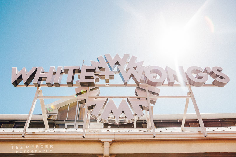
In March I was given the opportunity to photograph the images for a new Auckland restaurant called White & Wongs (as well as newly opened Burger Boy, and Sardine bar, all in the same block). It went rather well as you can see in the previous blog entry on the subject, and the audience’s response to the imagery has been nothing but great. Good news all around and I’m a big fan of providing mileage from a photo shoot, like all those seemingly random detail shots of silverware laid out nicely in front of a setting sun, or the shots of vases in the corner, they all find a home when the client is looking for something to jazz up the background of a site or provide a deeper and broader look into what a company is all about because a picture of a food is mostly a picture of food until you give it some context and setting.

So yeah, I was called back to do another shoot for another few restaurants around the waterfront and Britomart areas of Auckland. Namely Botswana Butchery, Harbourside (upstairs in that big brown building), and some other supplementary shots of the restaurants shot previously. It turns out there were some very popular little dishes on the menu that we didn’t shoot (I don’t think anyone expected the popularity) and some menu changes that needed to be reflected with updated imagery. That’s 2 whole restaurant shoots including food, prep, venue, details, cocktails, then another 2 food shoots, then a cocktail shoot, then a shoot of some diners enjoying the venue. In one day. With lighting and that whole shebang.

Easy.

My day job for the past 3 years was editorial photography for a pretty big magazine, some portrait stuff, a lot of food, product, fashion, corporate… the whole gamut because basically if it needed to be shot, I’m the guy that gets sent to shoot it. I was always pretty quick due to having to snatch quick photo shoots with wrestlers at GPW before they went to the ring, or shooting bands in America 15 minutes before they went on stage. But in the editorial realm you get maybe 5 minutes with someone and that’s 300 seconds to do your job and go home with something not only printable but something actually worth printing that you’d want in your portfolio. I’ve said to photographers before that the shoot starts before you pick up the camera: Checking out backgrounds, looking for lines, looking for areas of interest you can use, considering where the light is or if it’s going to bleed into the scene (and you might want that) and analysing a setting or environment is all part of photography before you even get to worry about lens choice. It’s also part of the reason why being a photographer is just more than knowing your f/stops or having a lens with a red ring around the end (I don’t speak Nikon sorry).

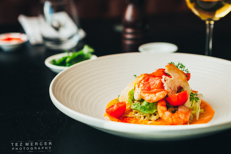
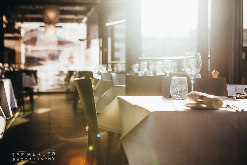
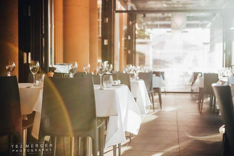
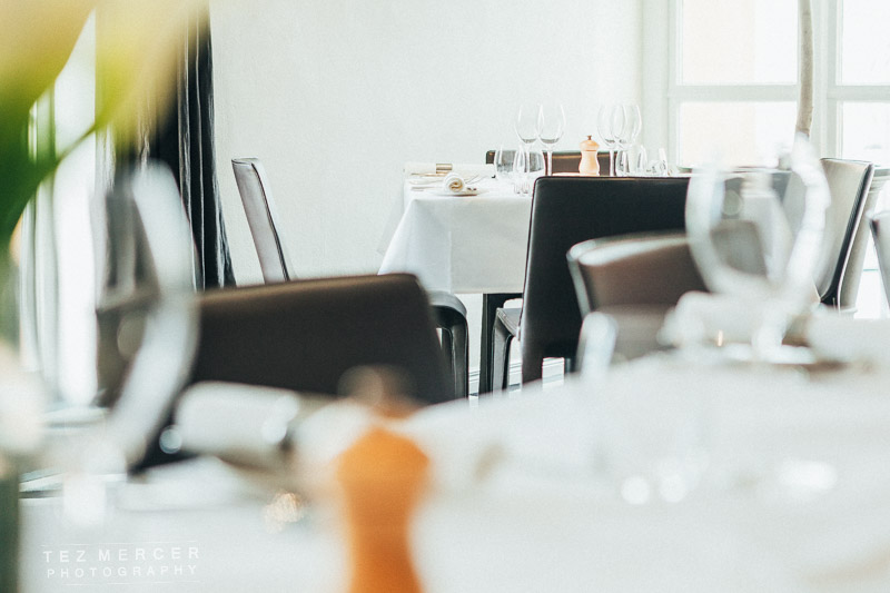
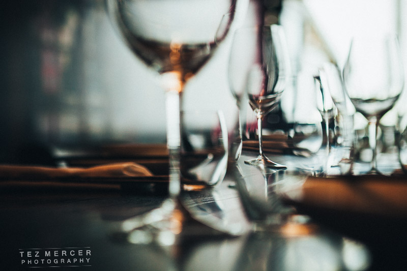
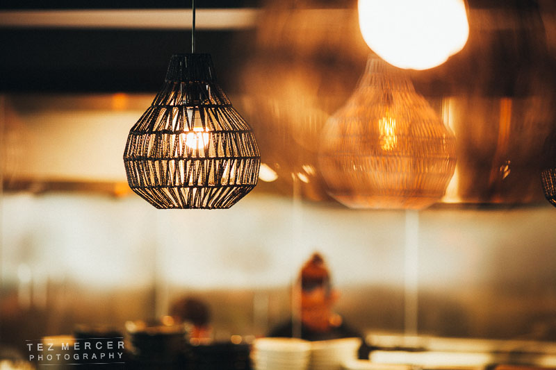
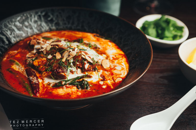
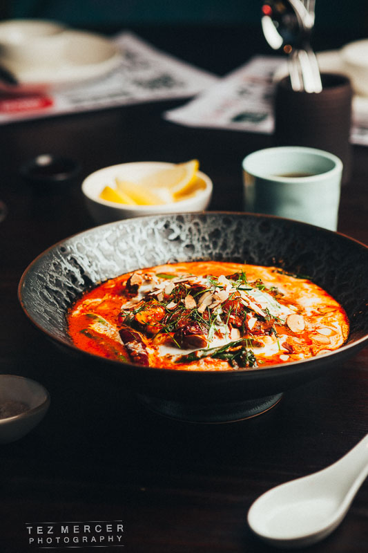
First port of call was Botswana Butchery, a fabulously decorated establishment overlooking the harbour and seating around 250. It’s a big place. Opulent, plush, luxurious, bordering on the grandiose and utterly fantastic.

It looks a little like this:


small (4 of 389) small (3 of 389) small (8 of 389)

Some of the kitchen shots:
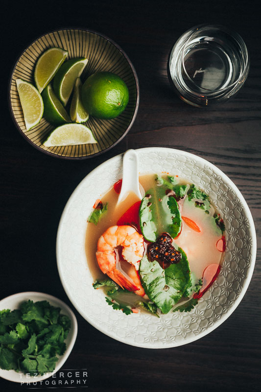
small (36 of 389) small (89 of 389) small (35 of 389) small (99 of 389)


Food.

I had a table set up in the back of the restaurant. My method is to strip the table, set up the gear, then add things back as you need them. It saves working around things you might not want there and means you’re starting from a clean slate and only adding what you need. It’s really handy to have some props around too – things like ramekins of salt, pepper grinders, a stack of napkins, silverware, glasses, some wine in some other glasses, sprigs of rosemary, lemon wedges, that kinda thing. You can add them in the background to tie colours together and/or to fill a gap in the frame but I have this thing about keeping it relevant to the dish. Like why would I shoot a slice of cake with a pepper mill in the back? It doesn’t make sense. Would cream, yoghurt, ice cream or something else be better suited? If in doubt, ask Chef. If it’s a dumb idea they’ll definitely tell you and it’s better to ask a 10 second question than spend 20 minites doing something and have the chef tell you that your prop wouldn’t go with that because x, y, or z… ultimately everyone is on the same side and all working towards making the experience look as good as it can.

small (80 of 389) small (75 of 389) small (67 of 389)


This is watermelon by the way:


small (20 of 389)


small (17 of 389) small (43 of 389) small (27 of 389) small (31 of 389) small (77 of 389) small (45 of 389) small (52 of 389) small (105 of 389)


Just realized I write thing blog for photographers or people interested in the craft/work. This blog is written mainly for education, because when I was starting out there wasn’t much in the way of actual info and blogs were just “hey, look at my pretty pictures, aren’t they great?” and great they might be, but how they were shot, or why they were shot using one method over another seemed like Top Secret information. I wanted to just write thing like I was talking to a friend at the bar and breaking it down because there’s no mystery to it, it’s all cause and effect and repeatable.

One day I should probably write something about how I actually get this work in the first place since that, to me, is one of those things that, as a photographer, you’re never ever really told. It’s like if you know your apertures and your background compression and your inverse square rule and the phone starts ringing. It’s like running any other business: if nobody knows you exist, you don’t get hired. If your work or your reputation sucks, you don’t get hired. If you don’t know how to quote and invoice, you won’t get hired. Basically there’s a ton of reasons why you won’t get hired, but there’s also reasons why you can get hired over someone else. That sounds like it was carved from Parmesan but I’m also not entirely wrong. I also digress.

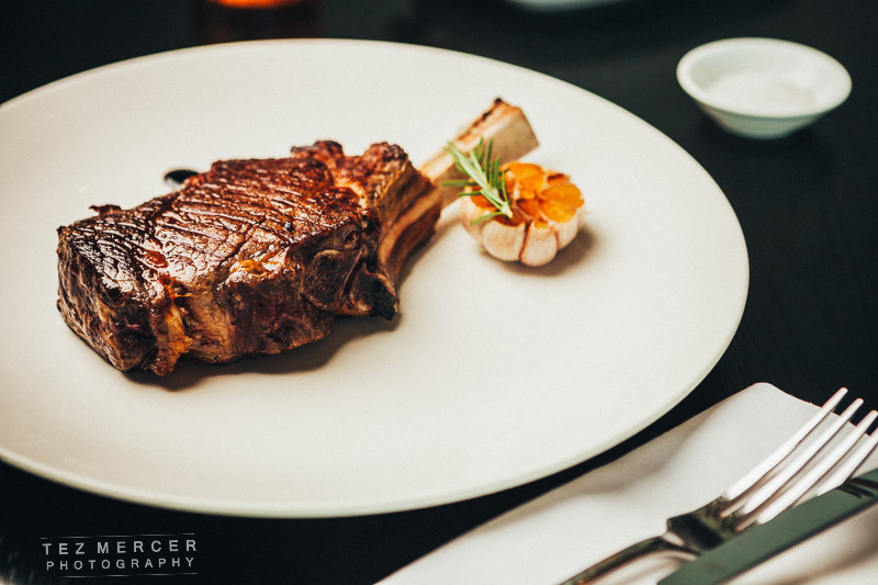
So, back to the photos: I shoot everything long. Like the extreme end of a lens’s zoom range or carrying a long prime (the shortest prime I have is 50mm and I never use it). I like the compression to make things seem a normal size and have normal proportions and you can draw out the bokeh by selecting an aperture that bring what you want into focus and making everything else look pretty. The vast majority of my food is shot at like f/4, or f/3.5 and around 70/85mm to get the compression and the shallow depth of field (which I’ll now call DOF because it’s quicker). Typically around ISO 200, because there’s visually zero difference between 100 and 400 on my camera and 200 saves me a ton of battery power for the lights (since they work half as hard compared to ISO 100).

Speaking of lighting, it’s really really basic: it’s a softbox with an AB800, and sometimes a reflector but generally not because I like showing the roundness of things and if the light is too even things can look a bit too flat for my preference. I have 6 lights if things get really crazy but I love that almost window light look of a single softbox close to the subject. I keep the light close because if it were far away it gets harder and harder, and by that I mean there’s not much distance between light and dark shades, like a midday sun- it’s dark, or it isn’t with little gradation, that’s hard light. The closer you keep the light source the softer the light is, and when we say that we mean there’s a large range of tones between light and dark. I’ve been talking in code for so long I don’t remember it’s code anymore.

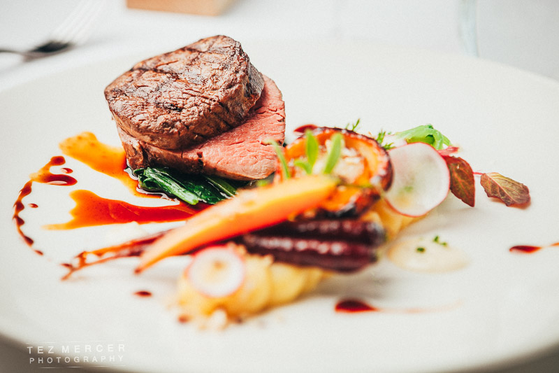
But as with all these things, sometimes it might not look as good as another option. This was shot with harder light to get that crisp reflection on top of the steak. It’s horses for courses, but the key is knowing what to do and when to do it.

small (79 of 389)


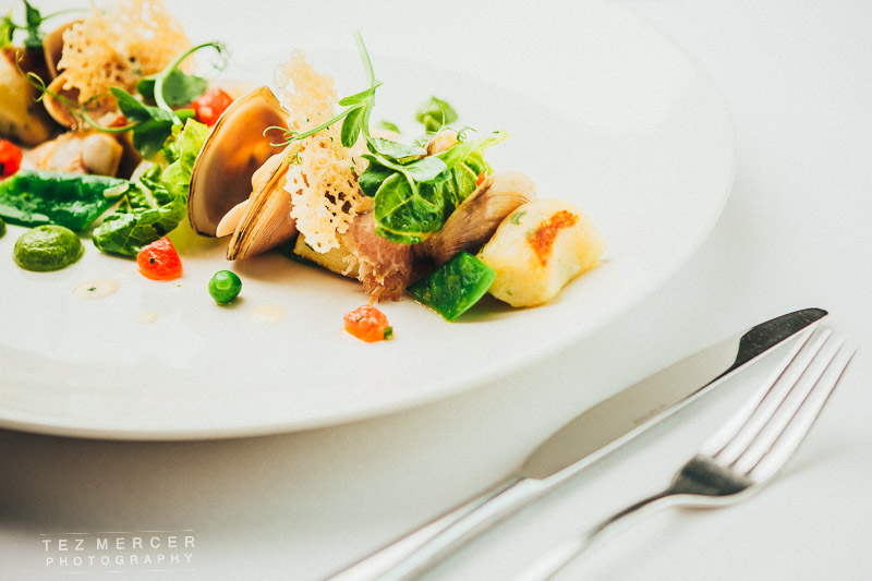
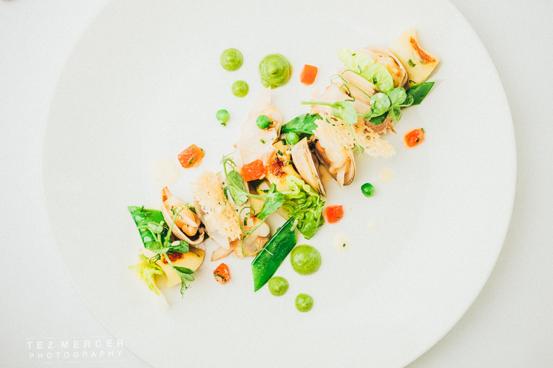
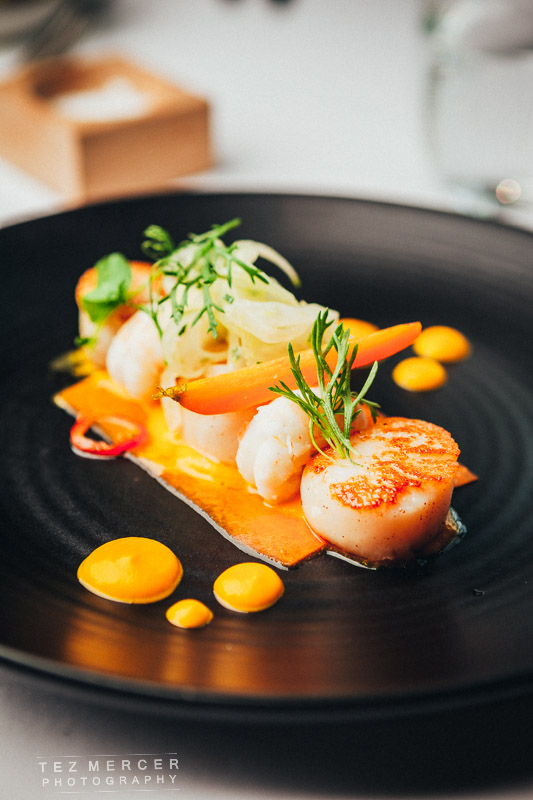
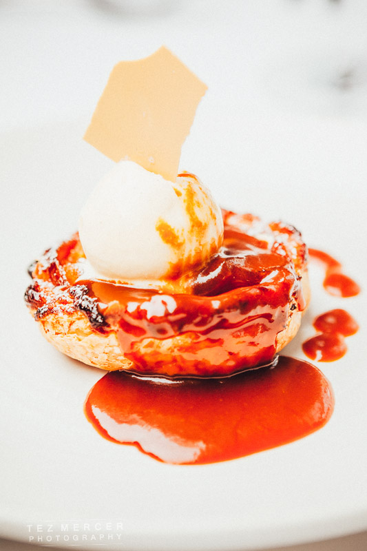
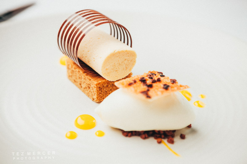
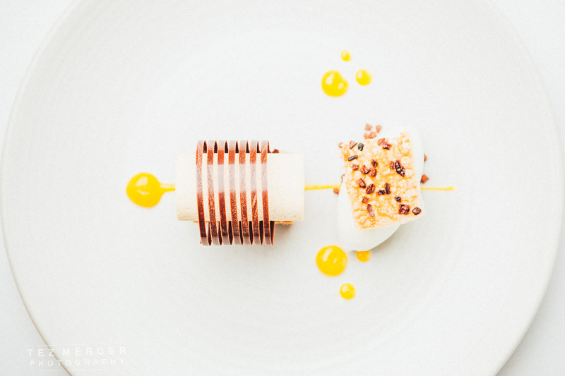
Then it was off to Harbourside. A note about this place: the chef is an artist. His food is almost a polar opposite of the image above. It’s intricate, layered, kind of unapproachable in the same way you don’t want to get to close to a very expensive vase for fear of ruining it and destroying its beauty. It’s seriously mind-blowing in an almost architectural or sculptural kind of way that food can look like this. It’s still a meal but it’s in the guise of something dainty and delicate with form over flavour, but it looks awesome and tastes great and the ‘wow factor’ is huge. When the beef wellington came out (the second one down with the ring) there were eyes on it from across the room. It’s a spectacle in itself. At other places they’d give you a cut of beef, some pastry, some veg on the side and call it done but this… this is art.

small (276 of 389) small (272 of 389) small (264 of 389)

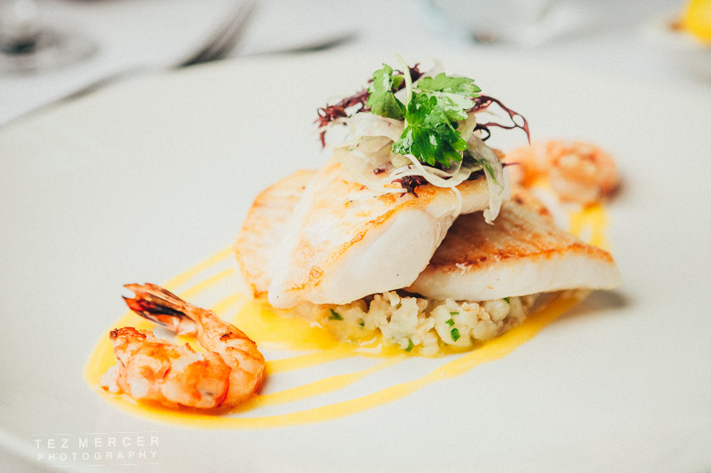
My process here was a little different in the setup. I didn’t want a background or things drawing the eye or blending in. I wanted it simple, clean, almost sparse because the food has enough colour and shape to make an image interesting all by itself. Strip it back and let the food do the talking because there’s nothing really I can add to make the dish look any better.

small (251 of 389) small (237 of 389)


small (249 of 389) small (261 of 389) small (291 of 389)

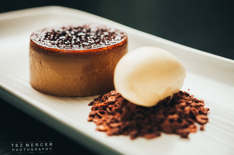
And check this thing out. It was all handmade, including that series of chocolate rings around the thing on top of the other thing.

small (283 of 389) small (287 of 389)


small (244 of 389) small (243 of 389) small (242 of 389) small (234 of 389)

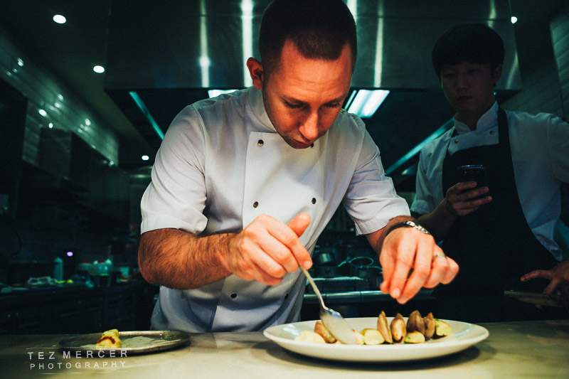
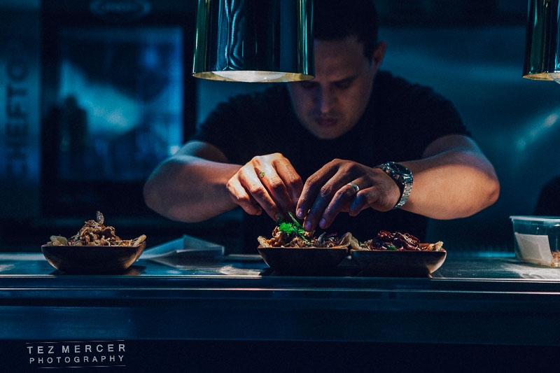
And there’s the chef. Doing his thing. And here’s some of the decking area and interiors.

small (323 of 389) small (321 of 389) small (302 of 389) small (307 of 389)


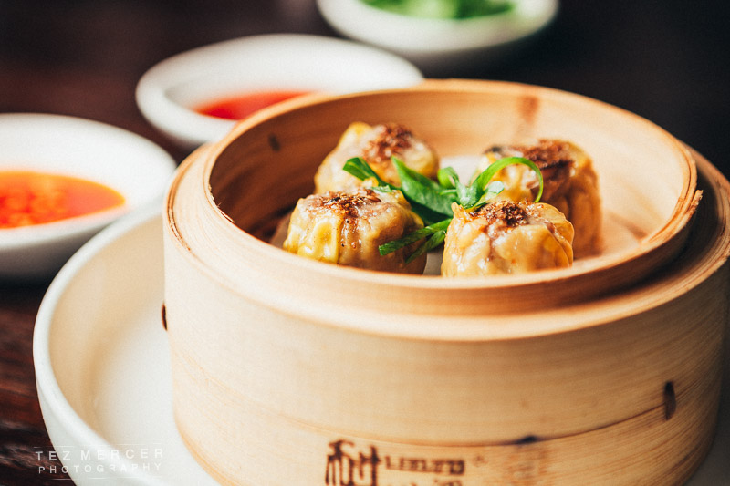
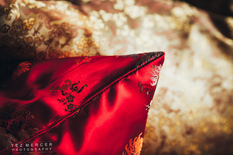
Then it was back to White & Wongs for some supplementary images. This room wasn’t fully finished when I was there last time.

small (184 of 389) small (182 of 389) small (186 of 389) small (174 of 389) small (188 of 389) small (151 of 389) small (139 of 389) small (146 of 389)

Dumplings. All the extra condiments in the background come with it, the challenge was to arrange and shoot everything in an attractive way. Since I shot a lot of the food last time I had a bit of a lead to go on as this was essentially more of the same, shot so it would blend in with the existing body of work available to the business so I had to reverse engineer my own shots from 2 months ago then do more of it.

small (141 of 389)

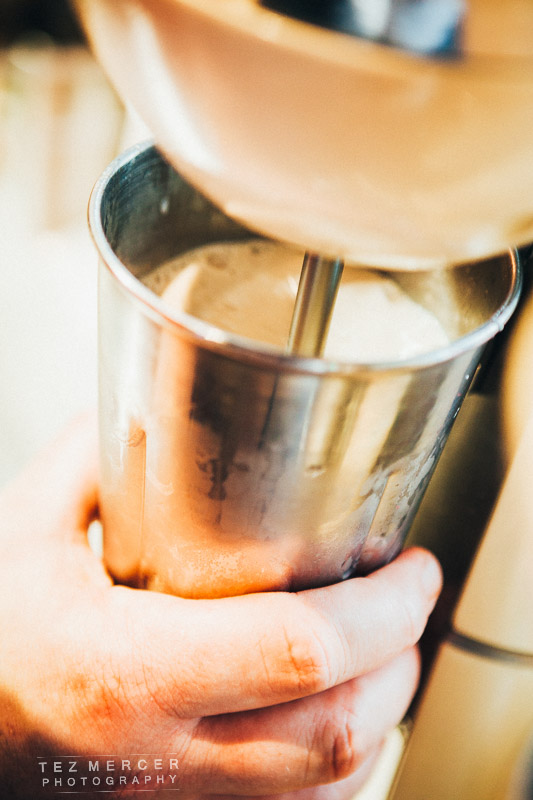
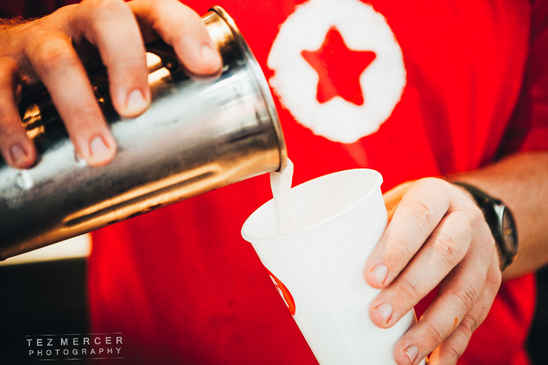
And a quick stop at Burger Boy to shoot some milkshakes.

small (220 of 389) small (221 of 389) small (223 of 389)


I shot some burgers too.

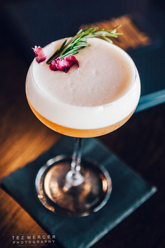
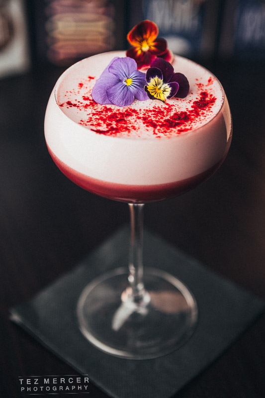
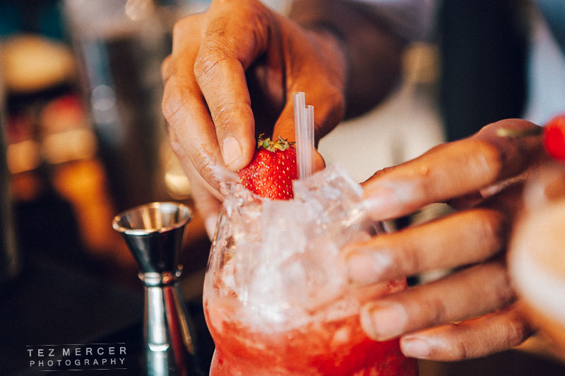
Then it was off to Sardine to round off the day’s shooting. This was a two fold shoot: one part was shooting cocktails, the other part was the social setting of photographing a group of friends out for an evening. This meant directing a group of friends and also make them comfortable enough with having their picture taken a few times while they were hanging out. I arranged the background and shot at this angle to show the bar, the colours, and get some shots of the staff in the background to add to the ambiance.

GG2 small (181 of 225) small (334 of 389) small (190 of 389)

And cue the people. All I asked them to do was smile a lot, laugh a lot, lots of eye contact and be social – share things, clink glasses, that sorta thing. A group of friends hanging out a bar with some food and drinks. Perfect. I didn’t worry too much about keeping the lines straight, I just floated around the table changing the angle slightly because I had the crux of the picture already laid out and knew what I wanted it to say. Then it was get the settings right (ended up being ISO 3200 because it was pitch black outside), checking the white balance and just shooting away. I didn’t want extra lighting so before I began shooting I moved the table to under a light so make it easier for me to get the lighting I needed to make the shots work.

small (373 of 389) small (365 of 389) small (360 of 389) small (367 of 389) small (356 of 389) small (369 of 389)

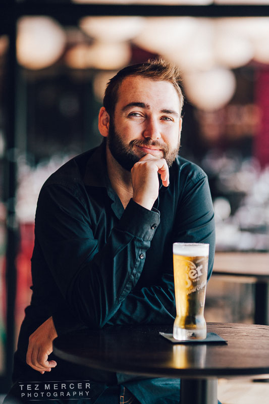
This image is grabbed from a set from inside White & Wongs. It’s one of those shots which sets a scene, tells a message to the viewer and that’s basically the whole story. You’re putting people in a scene, or in a setting, or somewhere they’d like to be. It’s social, not massively formal, close, warm, good food with good people. I’d call this one a success.
small (379 of 389)


A busy day indeed. I got home at 11pm, edited the images the next day and the client had them by 4pm that afternoon at full res and good to go.

Onto the next one.


Food glorious food – and venues, chefs, cocktails, etc

Waddup.

This was a massive shoot. 3 new venues, huge menus, a 200 seater restaurant, a cocktail bar, 10-chef kitchens, everything brand spanking new and a view looking out on to the ocean. There was even a cannon somewhere along the way. Much fun.

So there’s a new place opened on the Viaduct, the region of Auckland renowned for high-end eateries, buzzing nightlife, and daring cuisine. This new place is called White & Wongs, it’s where the maritime museum used to be (they moved around the corner). They’ve done a wonderful job with the interior – it’s plush, opulent, spacious, comfortable, welcoming, and that view just pulls you through like a giant magnet. Amazing to think the maritime museum had this all to themselves for years.

I was asked to come in and shoot the food, the venue, service, chefs cheffing, waiters waiting, the whole shebang. It was a lot of fun.

GG2 small (42 of 225)


For this shoot I wanted to use a warm colour palette. I’ve spoken about white balance and colour choice before but look at these shots, then imagine if they were tinted blue or colder. The whole thing would look less inviting, smaller, darker, unfriendly, and basically everything you don’t want in a restaurant or commercial space. Because of this choice I set the white balance in camera to 6200k, which is pretty hot (too hot for skin tones) but gives a warm orangey tint to whites and leans the whole image to a warmer range of colours.

GG2 small (37 of 225) GG2 small (34 of 225) GG2 small (22 of 225) GG2 small (21 of 225) GG2 small (44 of 225)

In most restaurants a lot of people have gone to a lot of effort to make the place look inviting and also thematically consistent throughout. Details like the cushions, glassware, plate size/shape, door handles, fork handles… everything has been chosen specifically for that venue and vibe so on every shoot like this I like to take a few minutes to just walk around and see what draws the eye, what details can be seen and use them. It’s one of those times when as a photographer you just need to trust yourself, if something catches your eye then ask yourself why, what made you stop. Is it the colour? The lines? The shape? How it interacts with other objects around it? Shoot it. The worst that happens is the client never sees it and you learn something from it, the best thing is you send it to the client and they think you’re great for taking the time to showcase their hard work.

Stuff like this:

GG2 small (127 of 145) GG2 small (128 of 145) GG2 small (124 of 145) GG2 small (38 of 225) GG2 small (133 of 145) GG2 small (134 of 145) GG2 small (141 of 145) GG2 small (125 of 145)

Showcasing the interior design and also, in this instance, the old-meets-new with the old rustic wooden steps that lead onto a newly laid and gleaming floor. And things like the lampshades, cushions fabrics, and contrasts between materials used. It’s also with things like this we can begin to build a textural palette of a space too. That might be the most pretentious sentence I’ve ever typed on this blog.

From my perspective I include these kind of shots so a client has the option of using them as filler images, or in a web gallery. I don’t expect them to function as hero images by themselves, or people to go “wow, what a great cushion!” and immediately book a table but they add depth to the narrative of what a space is and what the vibe is like within. You’re setting the scene a bit more than just throwing up a shot of the main dining area (which of course you need), such as this:

GG2 small (1 of 8)

That shot was a total bitch to shoot. It’s midday on a glorious summers day, the sun is streaming in yet inside is kept subdued and cozy where the lights are dim. This means you’re shooting a massively contrasty scene. You can see the shadows near the bottom edges of the windows and where I’m standing taking this pic is pitch black on camera compared to the outside. This ability to show the huge extremes from pitch black to blinding sunlight is called dynamic range, and you need to maximise that dynamic range to include all the tones in an image. There’s a few ways – you can take images at different exposures and stack them together – but what I did here was shoot at the lowest contrast possible, expose for the highlights outside, then in post-processing bring up the shadows and exposure of the inside only to equalise the image. It’s not as complicated as it sounds. Basically point the camera outside, take a note of the exposure settings needed to get it around +1 or +1 1/3. Then switch to manual and tweak those settings while you’re shooting the room. After 3 attempts and chimping the histogram you’ll have it locked in where the dynamic range is big enough to show everything you’re shooting. Camera sensors are very smart but they still haven’t figured this out yet.

People come to restaurants for the food. It looks like this:

GG2 small (28 of 145) GG2 small (23 of 145) GG2 small (30 of 145) GG2 small (40 of 145) GG2 small (38 of 145) GG2 small (35 of 145) GG2 small (8 of 145) GG2 small (6 of 145) GG2 small (44 of 145)


These were lit with a softbox from camera left or right and a reflector on the other side to kick some light back into the frame. I wanted to keep it luxurious, let the colours in the dish pop and hopefully compose it where the eye is drawn to the main plate whether through colour or leading lines. I know there’s some duplicates in there but it’s imperative to provide some options. I’ve no idea if a website will email asking if they have a landscape photo, or a portrait image, or whatever fits in their spread, so you’ve got to cover the bases and shoot the same thing in a few different ways in case they come looking for it. Again, the white balance is set to 6200k to really warm up the colours. It helps to make food look vibrant and fresh. If you set the white balance to auto in post it’ll make everything look very blue and grim. You don’t want that and if I was eating somewhere I wouldn’t want that either.

The light was about 3 ft away, and set for aperture f/4 at ISO 160 and around 200th of a second shutter speed. Since my strobe is lighting the entire scene I don’t need a slower shutter speed to bring in any ambient light, like if I was shooting at 1/50 of a second the natural light would start coming through. Not always a bad thing but if it’s from a light source with a different colour temperature (fluorescent lights for example) then that becomes a whole new ballgame of balancing kelvins and I’d rather not go into that, or deal with it unnecessarily so I don’t and the softbox takes care of everything.

I try and shoot food as long as I can in the space available. You get the background compression and the depth of field by shooting things long. Shoot wide and the scene distorts, the dishes look tiny and you start introducing distortion and curvature. Not good. These were all at 70mm which is plenty long when you’re standing on a chair trying to compose a shot on the table. Also, the angle I tend to go for is ‘diner angle’, that is the same angle at which you’d see the food if it were being served and you were sitting there waiting for it.

3 things to help you out with food/kitchen photography:

1- Everyone is called Chef in the kitchen. Call everyone Chef and you’ll be fine. It’s a sign of respect as well as being useful if you don’t know names.

2- If you’re in a kitchen shooting, communicate what you’re doing and where you’re going. Say “coming behind” if you’re passing behind someone so they don’t turn and pour something onto you and potentially waste a dish, say “over your shoulder” if you’re shooting over their shoulder. Be clear and be concise. Don’t explain why, just say what you’re doing clearly. I’ve seen photographers get in the way, get bumped into, knock plates, be very close to knives, and general myopia. Don’t mess with the guys at work, show respect and you’ll be welcomed back.

It’s their domain. 

3- Ask Chef if there’s a presentation side to the dish. That’s the side they want the customer to see when the dish is set down in front of them and they usually have an insight into what they want to showcase. You don’t have to take their advice, but ask for it because you never know. It also shows respect to Chef that you’re asking for their opinion and input into the process. 

I also shot some of the cocktails from Sardine, the cocktail bar next door. Also some detail shots and the bar manager himself. Names to faces and all that.

GG2 small (189 of 225) GG2 small (181 of 225) GG2 small (207 of 225) GG2 small (210 of 225)


The portrait was shot with a 135mm lens, that’s why the background is so awesome. Everything else was shot at 70mm since the only 2 lenses I use 99% of the time are the 24-70 and the 135mm. I have others, some wider, some longer, some faster, but those 2 lenses are so awesome they’re the first things in the bag on every shoot unless I want a specific look.

Here’s some more images of restauranty stuff.

GG2 small (122 of 225) GG2 small (101 of 225) GG2 small (89 of 225) GG2 small (76 of 225) GG2 small (130 of 225) GG2 small (59 of 145) GG2 small (69 of 145) GG2 small (114 of 225) GG2 small (5 of 8) GG2 small (143 of 225) GG2 small (65 of 145)


That’s a guy chopping stuff btw. More miscellany but this time I wanted a hands on feel of a restaurant in flow, so that’s drinks being poured, smiling diners celebrating, Chef asking for service, that kinda thing. Something with a bit more motion about it. The checks is something I always like to photograph because I think it looks cool and if people see a busy stack they know the kitchen’s busy, and if the kitchen’s busy then the restaurant’s busy, and if the restaurant’s busy it must be busy for a reason.

And I think that’s about it. Over 2 days I ended up submitting around 350 images to the client across 3 different venues and menus. They were long days, with a lot of ground to cover but it was all good work and the staff at these venues are great so they have my thanks for their patience and respect and not asking why I needed another bowl of limes, or not minding when I ask if I could could have a black ramekin and not a white one, please?

Hopefully that was helpful!

Cheers.

tez

Converse Jack Purcell w/ Sammuel Levi (@styledlevi)

I was asked to shoot a campaign for Converse to showcase their Jack Purcell sneaker. The brief was ‘a day in the life’ style, pretty much following around fashion guru Sam Levi on his day to day activities wearing the shoes. The client also wanted a minimal, candid, informal style to the photos and cropped to a square so it would fit in with Sam’s Instagram following (he’s a popular, and very nice, dude). I asked Sam to bring a bag with a few changes of clothes, maybe 3 tops, 3 pairs of pants, and of course the shoes would be the Jack Purcells and we could get the shoot out the way in a couple of hours.

This kind of shoot is really refreshing compared to my normal stuff with the big lights, the venues, the styling etc etc. This was literally walking around taking pictures, if something looked cool or jumped out, we’d talk about it and use it in the shoot. I wanted a few different backgrounds in this to showcase the versatility of the shoes how they can be worn in any occasion and still look great and fit in.

Setup was minimal too, 1 camera, 1 lens, 2 batteries. All good.


Purcell (37 of 85) Purcell (25 of 85) Purcell (27 of 85) Purcell (34 of 85) Purcell (13 of 85) Purcell (6 of 85) Purcell (15 of 85)


I didn’t want to just spam the client with pictures of shoes… of course the shoes are important but the lifestyle they represent is more so, and it also means I don’t have to just shoot a guy’s feet for 3 hours. The focus for me was on strong shapes and lines in an image. If you look at the ones posted here there’s a lot of linework going on which hopefully keeps things interesting and adds some dynamism to the shots.

Purcell (39 of 85) Purcell (59 of 85) Purcell (60 of 85) Purcell (65 of 85) Purcell (67 of 85) Purcell (71 of 85) Purcell (75 of 85) Purcell (74 of 85) Purcell (78 of 85) Purcell (80 of 85) Purcell (68 of 85) Purcell (62 of 85)

Since it’s Instagram-inspired I wanted a vintage (dare I say ‘film’) look to the images, which was achieved by manipulating the curves panel in Lightroom (or Photoshop). There isn’t really one ‘recipe’ which works as what works on one image won’t work on another but the starting points were raising the black point, lowering the white point, adding a bit of grain, cropping to a square, and then manipulating the red and blue curves to tone the highlights and shadows. Every now and then I would use the main RBG curve to lower the brightness and give a bit of an underexposed look like you can see where Sam is walking down the steps. Cool stuff.

So overall, a minimal shoot but by no means less difficult than others. The vibe and feel was the most important thing, and for me it wasn’t so much about crystal clear sharpness and removing shadows in an image, but about representing the lifestyle of a vital young dude. Cheers.