1

Interesting times in interesting places.
Feet poking out from a sandalwood pyre. He was likely someone important, or rich, as you can tell from the closeness to the holiest river, the Ganges, and also by the type of wood as sandalwood is expensive and is only affordable by the wealthy few.
I remember when we were first in Varanasi in 2008 one body was being cremated so close to the Ganges that a wave lapped on the shore causing the pyre to break and the body to tumble into the river where it floated along with the current before drifting out of sight. This was considered to be most auspicious by the deceased’s mourning party but for me, as a jaded westerner, was quite bizarre. I remember it looked like a white plastic bag bobbing up and down peacefully on the waves as it drifted downriver, over the horizon, and into the sun, with a soundtrack of tearful moans and awestruck prayer.
Yes you can smell it, and yes you can see it from far away. Sometimes the cremations are so numerous that it looks like the shoreline is on fire, and sometimes a white ash falls from a sapphire sky that for a second makes you think of snow until the second second when you realise what it is and feel something between “oh shit” and “wow”.
I had permission for this shot from the Dom (caretaker) who, in exchange for a random chat about life in New Zealand, allowed me to quickly snap some photos of what is normally a sacred affair where cameras are, if not forbidden, most def unwelcome.

Other stuff I do

I build guitars.

Electric ones.

For myself.

I’ve sold a couple.

I learned to do this because I was taught how by someone far more skilled than I’ll ever be. They needed pictures for their website and business, I wanted to learn how to do this. It was a contra deal that worked well for both parties since I think that if you can build a guitar from scratch, you can probably build other things too. The first one I made is at the bottom – the stripey one – made from bits I found in the offcuts bin and laminated together to a 25″ scale thing that made a noise and played pretty well considering. I sold that to a kid for $100. It was his first electric and he’d been having a hard time finding anything left handed that was a) decent and b) affordable. He’d been mowing lawns to save up and when he came to pick it up with his dad it reminded me of when I got my first guitar (I was 14 too, and borrowed the money from my dad and paid him back over the next year). We’d gone full circle and I hope he’s still kicking butt. I heard he played it at his high school talent show.

People tell me “I could never do that” when holding the finished article. That’s total crap. It’s a million small jobs that when put together make something usable. Like I could never build a house, but I can probably learn how to lay a brick, then another brick, then another, and so on until I’ve got a wall. And yes it’d be worse than a professional’s wall, but I bet my 8th wall would be pretty good. Same with guitars, same with anything. We learn by doing after all. All the theoretical study in the world doesn’t get those neurons working together. How can you read about the kickback of a table saw, or how tight to have the bandsaw without trying it out.

The first step to finishing is starting.


I’ve built 8 now. They’re in a rack in my office next to where I edit my photos and write blog entries.

I also design and build effects pedals. These are the little boxes that sit on the floor between the guitar and the amplifier. The guitar’s signal goes through these boxes and they do certain things to that signal- distort it, warp it, break it, echo it, a whole lot more – and they’re circuit boards inside a box and they’re turned on and off by a footswitch on the top.

Some of them look like this. They’re metal boxes, powdercoated white, painted with acrylics, then clearcoated with enamel.   Fun things that make a noise.


The favourite egg

A client once asked me what my favourite shoot was.

I had to think. I didn’t know offhand.

Is that like asking a chef which egg they cooked was their favourite? I don’t remember half of the shoots I’ve done after 13 years of doing this for a living.

But. I said I’d get back to her when I’ve thrown the question around a few times.

My favourite shoot was the time when the owner of a restaurant needed some imagery for their walls and by extension would also need similar imagery for promo material, websites, menus, that kind of thing. They’re based in West Auckland (the far west Auckland, not New Lynn or Avondale or even Henderson, but getting out past Titirangi and into the bush) and take pride in the local environment and wanted to showcase that inside the restaurant as well as out. I asked if they had any ideas of what that looked like. They said “Whatever you think is cool”.

Whatever I think is cool.

And that was it. I bollocksed on about this a while back – trusting your eyes, ‘nobody sees it like you’, that kinda stuff. And as true as that remains, and as true as it also remains that the skill for seeing these things needs to be honed and nurtured, it’s also pretty rare for a client to just trust a photographer like this and send them out, to get the goods that represent their brand to the outer world without a brief nailed down or manicured by marketing people. Just shoot what looks cool.

So that’s what I did. I got up at 5am, made the 45 minute drive to where I thought would be right, and shot stuff for about 3 hours. That day was hideous – rain, wind, cold, a heavy damp mist that stuck to everything like a grim sheet, and me with a 135mm lens trying to pick things out among the fog wondering what the hell I was doing. But, as any photographer knows, you have to come back with something. Even if that something is very different to what the client expects, you need to turn in something. So I turned in abstract shots of fern leaves, heavy with rainwater and bending under the weight, dripping cold runoff into the mud underneath. Shots of bark saturated and scarred, wider shots of forests receding into the distance under a blanket of grey fog, the dim outline of the hills just a suggestion in the background – a slight slate grey among the cement grey of everything else.

They loved it. They said they were glad I didn’t do “the usual shit” of sunsets, kids playing while the sun dips and flares behind happy mum and dad, content with their world entire. One of those images was printed 3m wide. 5 years later and they’re still being used everywhere, so much so that they are synonymous with the brand itself. They believed in me. I believed in myself and just trusted that what I thought was cool would be enough.

These aren’t those pictures. Sorry. That’s probably anti-climactic. However this set is along similar lines. Not intending to use them as part of any campaign, it’s somethings that capture my eye and make me look a bit longer than a passing glance. In the old days I use to question this. What was it about that wall? That stack of tyres? That shopfront? I stopped after never finding any answers, and even if I did, would it change anything? I hope not. I like the solitary silence of taking everyday pictures without worrying about what comes after. You should too. Remove the noise. Stick to your guns. See what’s cool. Don’t worry about what comes after. I think you’ll learn something.

I have learned that I like lines.


Canon’s new machine gun: EOS-1D X Mark III

Important things:

  • 20.1 megapickles
  • 20 frames per second (FPS)
  • ISO range from 50 – 819,200 (expandable via menu options)
  • CR3 file format (new)
  • Wi-Fi and Bluetooth built in
  • 5.5K RAW (60p), 4K DCI (60p), 4K UHD (60p), Full-HD (120p)
  • 2 x CFexpress storage
  • 1440 g without lens, but with batteries
  • Probably immortal
  • $6499 USD at launch

You’ve heard these things. You’ve probably seen them alongside football pitches or basketball courts or slung around the necks of war photographers. They’re big. They’re rugged. They’re iconic. They fire an insane number of shots in a second making them sound like machine guns as the shutter fires away under an index finger.

Imagine a normal DSLR, then stick a battery grip on the bottom, then wrap the entire thing in magnesium alloy and you’re pretty much there.

Image courtesy of DPReview.com


It’s a monster. Better spec’d than anything else on the Canon roster with a bigger battery and more gubbins, yet 100g lighter than the previous version (the mkII, released in 2016), the mkIII will find its home in press kits the world over. The shutter is made from kevlar and can stand up to 500,000 shots, which at 20 FPS, it will need to. If you went full out at 20fps you could reach that lifespan in about 7 hours. As we all know though this is Canon’s conservative estimate and 1d bodies reaching 2 million shutter actuations aren’t unheard of. If yours dies at 500,000 you’re unlucky.

But, it’s an interesting time for the release as Canon have recently announced there will be no new developments in EF mount lenses and will be focusing on RF mounts from now on – the RF mount appears only on their mirrorless systems and not their SLR mirror-based bodies, on which the EF mounting system has been featured for about 30 years. Times they are a changin’.

So this might be the last 1DX as we know it. Canon have made noises about a professional level mirrorless system and rumours on specs, names, prices etc are all out there in the wild but nothing confirmed. It is clear though that Canon, and every other camera manufacturer, sees mirrorless technology as the future of photographic equipment and the more investment put into it the cheaper the tech becomes.

At the onset of 2020 Canon’s mirrorless offerings have been well-received with a feeling that they weren’t quite where they could be. Canon know this and their announcement of a professional body is well timed. It keeps those thinking of migrating hanging on for the announcement, keeping them in the Canon ecosystem, disrupts the footing of the competition, and shows an attitude which is clearly looking down the track at the next generation of pro camera.

But this isn’t about mirrorless. It’s about the 1dx mkIII, the last machine-gunning behemoth we might see. Sometimes it’s a sad day when progress comes knocking.

Emilie – portraits

Say hello to Emilie. We did this photoshoot in my garage with a 3x3m white backdrop attached to the garage door by neodymium magnets. A what? It’s a magnet, but super strong. Don’t get your fingers caught between them. The ones I have are 15mm x 5mm, and 4 of them will hold this huge piece of material to a garage door for all eternity. They’re much easier to deal with than blutack or tape or whatever.


Anyway.


These are all shot with the 135mm f/2 at around f/4. It’s such an incredibly beautiful lens that I hardly get to use unless I’m in the studio for a specific look. More often than not I’ll grab a 100mm macro for product and a 70-200mm for whatever else, just for sheer versatility. But, there’s only one king of portraits and it’s the 135mm. They also happen to be (comparatively) cheap on the used market as I think people buy them, then realise they’re pretty specialist and their workload might not be the right suit for a long lens with a really slim depth of field. But then again, I shot sports with the 135mm back in the day because it was the longest focal length I had for a while.

I’m talking a lot about the lens… suffice to say it’s very nice albeit clunky.

The lighting here isn’t especially revolutionary. We’ve got 2 gridded strip boxes around the front and a socked beauty dish up top. 3 x Godox AD600. It’s a versatile, tried-and-tested 3 point lighting system you can use for just about anything.

When I shot product for a living this was all we used (not Godox though) for product shots you’ve probably seen on TV ads, catalogues, everywhere since we were shooting for basically every FMCG company there is. It’s also the lighting style we used for talking head interviews (but with a softbox for a hair light). The lights up front are both at a 45 degree angle to the subject which would normally be really flat and kinda passporty. But by using the grids and a stripbox (which are pretty narrow) you get light coming out sort of in a vertical letterbox shape, not wide enough to be flat so you get some nice falloff and shadows around the edge of the face. Good stuff.


Then if you move the strip lights to the back and use the beauty dish as the key light, you get something like this:

The exact same setup, I just moved the strip lights behind Emilie and adjusted the ratios a little to make the beauty dish fire a bit stronger since it now has to do more work covering the whole side facing the camera. Here we’re just using the strips as separation lights to make her look more 3d. Easy peasy.

I wanted to keep the shots natural looking but muted a little bit. So in terms of editing there was a bit of split toning going on, some editing in curves layers to minimise the contrast but adding some density to the midtones. I also didn’t want to airbrush the skin. Emilie doesn’t need it. She’s a beautiful woman and there’s an honest tenderness to these photographs that I personally felt wouldn’t benefit from smothering the crap out of it, if anything that would be disrespectful. Respect your subjects, folks. Talk to them about the look you’re going for. They might want to be smoothed out and look like a fashion campaign. 100% cool, as long as you’re all on the same page.

Anecdote start:

I posted one of these images on Facebook and some people chimed in saying I should have “removed the imperfections”. I asked what they meant (although I had a hunch) and they mentioned the freckles, the ‘blemishes’, the rings they think they see under the eyes… basically saying they think I should have turned this into another shoot with another model who’s airbrushed to crap to add to the already too-big mountain of overly-processed garbage that’s rammed down our throats. Not taking into account about my work, my style, Emilie’s look, Emilie’s style, Emilie’s brand (she’s a successful musician performing a thousand times a week), anything remotely linked to actual people present here. Nope. Just dumb it down to “if you’re shooting a girl then it should look like xyz”. Nope. Fuck that. Respect your subjects, folks. Respect yourselves and your vision.

Then again, people also applauded the honesty present in the image and the strength demonstrated by not walking the line so I apparently have no idea what I’m talking about.

Anecdote ends.

My ‘direction’ was pretty much “stand there and look at me, please”. Understand we’re not shooting corporate headshots here, we’re not shooting a beauty shot for a makeup campaign which needs something different because they’re presenting a different image and for that, you direct accordingly to get that story across. I shoot corporate headshots all the time, shoots like this are like fennel, a palate cleanser.

With a shoot like this, I want honesty, I want the connection of a real live person looking right down the barrel and showing who they are… and from that perspective it sometimes feels like any direction needs to take a back seat because it gets to the point where you put your own projections on someone else by telling them to stand a certain way, look a certain direction, move that arm, move that shoulder, whatever. No. Stand there and look at me, please. Nothing else really matters. It’s a portrait right, guys? Although in all honesty I did ask Emilie to turn to one side because that’s where the light is. I have found that being able to see the subject is rather helpful.

All that for 5 images. That’s like 200 words an image.

Take home facts:

  1. 135mm is cool.
  2. Emilie is awesome.
  3. Make the photos you want to look at.
  4. Trust yourself.

Sunshine Coast & Brisbane

I didn’t drop off the earth.

I went to Brisbane and the Sunshine Coast, QLD to pay homage to the great Steve O.

It looks something like this.


Impromptu shot that looks like an ad for Reef (it isn’t).

Sun&shadow. 


Sunshine Coast is like a Mount Maunganui but nicer. Wide sweeping promenades roll beneath a canopy of beautiful trees whispering harmoniously with the eternal boom and hiss of the sapphire ocean. It’s a beautiful place. Although that doesn’t quite encapsulate how it is to be there. Yep, it’s very pretty but it’s expansive and raw and tinged with the shadow of the looming expanse of nothingness that lies at Australia’s heart. You’re not there, but you feel it – an entropic backdrop upon which this jewel is pinned and, for me, a lover of all things primeval and savagely beautiful, the Sunshine Coast is a win.


Went whale watching. I packed light. Small (ish) lenses only. I stuck to what I know.


Just inland from here (Mooloolaba) you’ve got the Glass House mountains. They look nothing like glass houses, they’re more like misshapen thimbles jutting out of the red earth to stab the enormity of sky swinging over your head but the name stuck.


On to Brisbane.


Tourist stuff:

Nice place. 22c in winter is alright by me.

Now we get to the land of the legend himself, Steve Irwin.  Australia Zoo everybody.

Animals. Kinda. 

Not quick enough but it somehow came out better that way.

The world famous bin chicken. 

Not animals:

Outtakes:

Trust your eyes. Not someone else’s eyes. Not the likes or the follows or the bullshit. If you see something cool then take a picture. Or don’t. But please, just trust your own eyes. Nobody sees it like you.


Automotive: 2019 Ford Ranger Raptor & how I shoot cars.

I think that’s a pretty cool shot. It’s a truck doing its thing on a New Zealand beach, which counts as a road and all the laws/rules that govern such a thing. As long as you’ve got 4WD and a permit, you can drive up and down a beach no problem.

TL;DR:

Shoot long. It’s OK to tilt the image. Think about the setting. 

Over the years I’ve shot a lot of cars. From Kias to Lamborghinis to Land Rovers, every one is a different challenge. Not least of all because of time constraints and location choices, like the good ol’ days of working for a national magazine and having literally 15 minutes to find a location, shoot, and get back to the office regardless of weather, time of day or any of those fun things to factor in. But, the flip side is it taught me to work quick, see the shot, get the shot, and get out.

Prior to this shoot for the 2019 Ranger Raptor I had a little discussion with motoring behemoth Dave McLeod from Tarmac Life – NZ’s premier motoring blog and information hub – to discuss the aforementioned location to shoot this kind of vehicle. It sounds obvious… and I guess it is, but where you shoot something and the setting in which it lives is all part of the story. We’ve been sadly forced to shoot a ton of cars in car parks over the years and it doesn’t help sell the product or the story. To me, trucks belong outdoors doing something messy. Muscle cars belong somewhere gritty. Race cars belong on a track. That sorta thing. Again, probably obvious but if you have a list of go-to options for each type of vehicle you’ve done half the work before you even head out the door.

Case in point: when I shot the Mustang. That wouldn’t look nearly as cool on a beach and the Raptor wouldn’t look as cool down this alley.


So, location. It’s important. In the same way that food photography isn’t about the food, car photography isn’t about the car. It’s about the setting and the environment.

What’s in the bag:

Canon EF 70-200mm f/2.8L IS II USM
ThinkTank Retrospective 10
Canon 5d mk3 w/ the grip
BlackRapid Sport Breathe strap

Unless it’s a muscle car I shoot long. I like the background to be part of the image so I pull it forward as much as I can. That invariably means I take the 70-200 2.8 IS MkII and not much else unless there’s something specific in mind. It’s a honker of a lens, weighs 1.5kg, about a foot long and one of the most inconspicuous pieces of gear out there.

If I need wider or just want that distortion (like in the shoot above) to elongate the nose or back I’ll take a 24-70 f/2.8 L mkII but mostly I’ll just grab the big white lens.

When I shoot cars I cover these basics:

Outside.
Inside.
Details.

And break that down a little more to:

Outside – front, back, sides, 2/3 (sort of angled)

Inside – seats, dash, steering wheel, whole cabin.

Details – anything that looks cool design-wise. Speak with the writer/client/dealership/agency if there’s anything they specifically mention and get a shot of it.

Again, probably super duper obvious but having a little checklist like this helps me stay on track and also means I’m not holding up the process by taking 4 hours to get the right shot of the car by walking around it 300 times looking for ‘the angle’.

Shoot long to bring the background into the shot.

Another thing I’ll do occasionally is tilt the image. On moving shots especially this looks a lot more dynamic if the car is moving upward into the frame, or downward out of it. Don’t go crazy, but 5 degrees here or there is totally fine. The shot of the Amarok above was tilted in post as I think it looks more interesting that way. The client agreed which is generally a plus.

Detail shots look a little like this:


I knew specifically that the article would mention Baja mode and the wheels so they get a shot.

Motion Shots:

I use the centre AF point and use AF Servo mode to track the subject. cropping in later if need be. Basically the camera does the hard work. Since I use back button focus on my bodies, I just hold it down to focus and shoot when I think it looks cool. I’m not a huge fan of machine gunning images and shooting 60 images in a burst. I’ll take 4 or 5 each pass of the car and refine the shot each time once I think I know what I’m looking for in terms of background or things like wheel placement or angle of the car to the camera. Taking thousands of pics doesn’t benefit anybody and yes, storage is cheap but more time in front of a computer unnecessarily isn’t my idea of a job well done.


Get out there.

Feed your self. Modelling. Lights. White walls.

Hello there,

After shooting food and interiors for 6 months I needed to do something for myself. Wait, that sounds somewhat selfish so let me extrapolate: one of the reasons we do this (and by extension painting, design, music, films, anything creative) is to feed that little thing inside of us that yearns to do something other than sit in an office for 9 hours a day watching the clock until we can become ourselves again.

Recently I was chatting with a dear friend of mine (hello, D) about ‘art’ and feeding oneself. The crux of my perspective is that for every bit of client work you do you’ve got to do something for yourself that isn’t for money, or to a brief, or with art directors or whatever happens on set/in-studio. For me, that’s sometimes walking off by myself in the woods and taking crappy macro shots of whatever I see in there, or it’s walking around the block with a 50mm and seeing what I see outside my front door. For you that might be throwing paint on a canvas, or carving something from windfallen branches.

And honestly, sometimes I come back with 20 awesome images and sometimes I come back with 1 that’s a 5/10 after 3 hours. That doesn’t really matter though, the fact is you’re out there indulging that part of you that needs to feel the breeze, see the rocks, and not worry.

Anyway, hopefully you get the point.

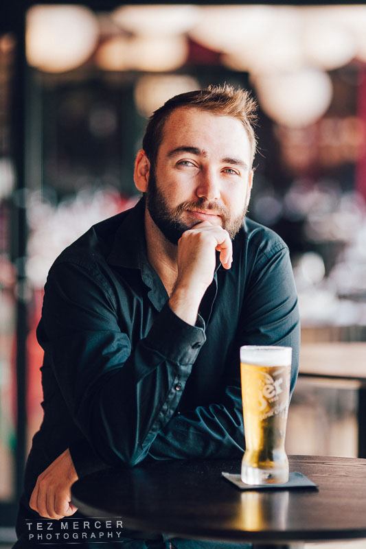
That leads us at last to the subject of this post: a shoot with a model I adore and love working with and an excuse to use my fancy lenses that don’t seem to get much use in the commercial realm in which I operate.

Super simple lighting setup here:

Key light – Godox AD600 into a softlighter
Rim light – Godox AD600 into a silver umbrella

Key is camera right, in front, and pretty high (look at the shadow under her nose). The rim light is around the back left which you can see is lighting up the model’s waist, shoulder, hair and providing the separation between subject and background. If that light wasn’t there, the whole left side becomes black and we don’t want that if we can help it. If you have to bring up the shadows in post you’re going to get noise (noise only lives in the shadows btw, it’s the camera sensor trying to put in information that isn’t there), so stick a light source round there (reflector, or have the model put their back to the sun) and you get a definite distinction between the layers of foreground, subject, background.

Some notes on the terms:

Key light – to me this is the light that covers the entirety of the subject from the front.
Rim light – you can call this a separation light, that’s probably a lot easier.

When I light I’m thinking inversely. As in, I’m thinking where I want the shadows to be as oppose to what I want to light. Then if you want to get into it you can drill down into how you want the nature of the shadows to be – hard, soft, gentle, harsh – then choose your modifier or setup to match. It’s the whole thing of ‘working backwards’ – envision what you’re aiming at and work towards it.

For this setup I wanted harder shadows:

I love that shot. The hands are perfect (nothing to do with me). This is literally a white wall in a hotel room and a silver umbrella at just above head height and more in less directly in front of the model pointing right at her.

This is where I need to give props to the model. My direction consisted of something like “hey, what about here?” and pointing at a spot on the wall in between the TV and the coat hooks. The rest is all her and it’s professionals like this that mean we’re going to get awesome images.

The lighting surely helps but you can only shoot what’s in front of you, and if they’re one of those people who think modelling is just looking at the camera so you get 200 copies of the same pose, you’re not going to have a productive shoot and, for me, it’s tiring to constantly direct as well as thinking about all the other stuff.

Same setup.

Now this was on a very sunny day in a room with an enormous window that takes up one wall. This meant that we’re dealing with a very bright light source and in order to shoot at f/2 or f/2.2 we’d need to be at a very fast shutter speed. The AD600 lights can get down to 1/8000 and sync, but then we get issues like colour balancing (tinted windows), shadows from the sunlight, and a myriad of things I’m not interested in dealing with. So draw the curtains and replicate the sunlight.

I wanted this to feel natural, like a lazy morning away, not obviously lit and setup or contrived. That meant roughing up the bed for 5 minutes by basically pulling off the covers then ‘making it’ pretty half-assedly, then throwing the pillows in an about right position to make it look slept in. I find it quite distracting and breaking the 4th wall when shoots in bedrooms are on these perfectly crisp sheets and very obviously just made beds… plus, nobody in the real world makes beds like they do in hotels.

Here I’m basically trying to replicate sunlight by using a big, soft light just off the edge of the bed.

The closer the light = the softer it becomes. Move that sucker in close.

There’s no separation lights or anything here, just the one light off to the right and a camera at 85mm and f/2. I wanted to be at eye level so it looks more intimate and honestly the higher up I got the more it just looked like an ass shot, which is all well and good sometimes, but wasn’t what I wanted to achieve. This is all about the face and positions of the hands and shoulders and, for me, I find it more alluring when it’s seductive rather than blatant. I got in touch with the model and asked if she could talk a little about her process during shoots:

“Tips I’ve learned are:

Always watch your hands, try to make sure your palm isn’t facing the camera.

Pick 5 different places to look when posing before completely changing the pose again, make small changes first, before making a big change of posture.

Try your best to act natural, not forced – you can always tell when a model looks uncomfortable in a photo.

Practice facial expressions, to bring something different to every photo – sassy, seductive, fierce, proud, etc”


Moved the light to the foot of the bed, switched to 135mm and cropped some shots to a 16×9 aspect ratio to make it look more cinematic.


That’s wide open at f/2, with the light down to it’s lowest setting.

In beauty shoots one of the most tried and true lighting systems is called Clamshell lighting, which is basically 2 light sources on an axis and the subject in the middle. Essentially, one light above, one below, model in the middle. It’s a timeless setup that isn’t always available due to space or time or a million other reasons. But, you can do the same thing by having the model lay down and put a light just past their head and a reflector or something just out of shot.

Like that.

Change the angle and you get this:

Exactly the same light but the model just twisted slightly so it fell differently. I think that’s a beautiful photograph.

Someone emailed me about editing. Specifically colour grading. You may have noticed that in these images apart from the monchromes there are no pure blacks or pure whites. That’s a stylistic choice made for this shoot, and in other shoots you’ll find the whole gamut. I made that choice here to make the images softer, less contrasty, sort of hazy, but have that warm mood.

Basically (and I do mean basically) you’ve got the shadows and you’ve got the highlights. Open up a curves panel and move the very bottom point slightly up, and the top point slightly down. Then go into the RGB channels and do the same thing with the different channels.

The way in which they work is roughly as follows:

RED CHANNEL – Moving this curve upward allows the reds to become stronger. Moving this curve downward means reds become weaker,  causing reduction of red in the image. In other words the colour opposite to red will appear – mix of green and cyan.

BLUE CHANNEL – Moving this curve upward will allow the blues to become stronger and making images look cooler. Moving it downward will introduce yellows into the final image.

GREEN CHANNEL – Moving upward introduces green. Moving it downward will introduce magenta/purple.

What does this mean? It means you can correct colour casts and introduce colour casts into your image. You can make the highlights warmer and the shadows colder for that orange/teal cinema look, you can cool down a very red image, or warm up an image such as a sunset where you want to double down on reds and oranges.

Anyway. I’ve waffled enough. Honestly colour grading is something of which I only scratch the surface and all I really try to adhere to is to make the skin tones look realistic. Beyond that, it’s fair game.

Hopefully this helps out there.

Keep on clicking.

tez


Characterisation.

Do you watch movies or TV shows? Of course you do.

I’ve always been fascinated by the way in which cinematographers and directors of photography (DOP) can utilise all our favourite things like depth of field, camera angle, lighting etc to enrich the feeling we get from a character: in other words you can shoot in such a way to characterise the cast. We can do the same in photography since we have much the same tools available, the only difference being we’re recording a single frame.

Years ago I mentioned how I typically shoot guys in rock bands one way, and female professionals another. That’s probably common sense, but breaking it down and we get into the same territory used in cinema.

If we use a low angle on a shot, and shoot wide, we accentuate height, width and convey a feeling of physical power which can be used to intimidate (at the extremes) or convey authority and control.

Here’s a shot of actor Tyrone. He’s a guy known for his roles as a bruiser kinda character – the bare knuckle enforcer sorta dude. Shooting from low and having his hands in the centre of the frame accentuates the size of his arms, and him looking down has that menacing look to it.

ty-jpegs-(1-of-82)-cmd


Here’s another example where I’m shooting low to make people look tough.


dawn-new
E
asy enough right? We’re all familiar with these concepts and see them a million times a day throughout media channels but it’s a tool to stick in your toolbox when you’re trying to present a feeling to the viewer of an image.

And this is shooting at almost the opposite way: eye level, warmer colour palette, longer lens to blur the background and convey approachability and friendliness. By warming up the colour palette we can make the images appeal in a totally different way than the cold-toned images above. To get this warmer tone I shoot around 6000K and might add a little tint in post processing to even out all the tones in a frame then desaturate just a smidge to stop it looking clownish.

AK-(41-of-51)


GG2 small (8 of 8)And I should point out this isn’t a gender thing, it’s not shooting guys one way and girls another. It’s just simply using angles, focal lengths, DOF, and colour grading to convey something deeper about a subject.

Food Photography Auckland part 439.

Hello there, thanks for tuning in.

Let’s make a cup of tea, sit back, put Gojira on your home stereo system and read a little bit about food photography.

See, ‘food photography’ kinda misleading. It’s over-simplifying the task because the food is only part of the frame, what you’re shooting is a scene, a memory that people want to have and an experience they want to share with their nearest and dearest. This is why pictures of plates by themselves don’t do anything to make people interested or do anything to make a kitchen any busier.

On my last shoot I heard the best thing I could ever hear from a client: “That picture sells food” the Operations Director said as he pointed to a picture of mine on a flat screen TV behind the counter where people order. It was a pretty innocuous picture of a sandwich looking fresh and inviting, bread all golden toasted and soft, next to a nicely blurred cup of coffee all steaming warmly, and way in the background a newspaper with the crossword page facing camera. All arranged quite succinctly on a wooden tabletop.

What does that image say? It doesn’t say “this will cost you $10” (or whatever it costs, I just made that up), it says “this is a nice relaxing thing to do before you start your day” and that, dear friends, is what a successful image needs (in this instance) – it has to speak.

That probably sounds pretentious, and it might be, but it’s also right. If you’re shooting food, sell a scene. Plates by themselves look like menu shots in food courts. Set the table how it should be, get a glass of wine, a pepper grinder, a salt shaker, set up another place for someone else while you’re at it since not many people dine alone.

And now here’s some food.

botswana-cmd


GG-Sept--42


All shot at 70mm, lit from somewhere close to behind with a silver reflector occasionally used camera right to kick some light back in. Nothing fancy.

When it comes to styling food, I like to fill the frame but obviously make the thing on the plate the hero/focus and like all my shoots it involved working backwards.

What?

If you don’t know what you’re aiming at you’ll never get it. If you can visualise the image in your head before you even pick up the camera or move a light you’re 90% there, the rest is just making it happen.

GG-CMD


GG3-BIG-32

And, since that restaurant was putting on a festival all about seafood we shot some stuff for use in EDMs, backgrounds for copy, print ads, social content the usual thing… I’ve probably rambled before about how commercial photography now is different to what it was 10 years ago. Taking pictures is still taking pictures but the outlets for the images is hugely diverse now. I give my clients image libraries, shots of everything like the venue, kitche, food, service. I want to enable my clients to tell their story through a curated selection of images and give them imagery they can use to reinforce or build a brand across all their networks like print, social, EDMs, web banners… the usage of the pics is limited only by the imagination of the marketing department.

And that’s about it, rather than throw 600 images at you to stroke my ego I try to bring meaningful information here and hey, maybe this’ll help.

Cheers.

tez

info@tezmphoto.com