Waddup.
This was a massive shoot. 3 new venues, huge menus, a 200 seater restaurant, a cocktail bar, 10-chef kitchens, everything brand spanking new and a view looking out on to the ocean. There was even a cannon somewhere along the way. Much fun.
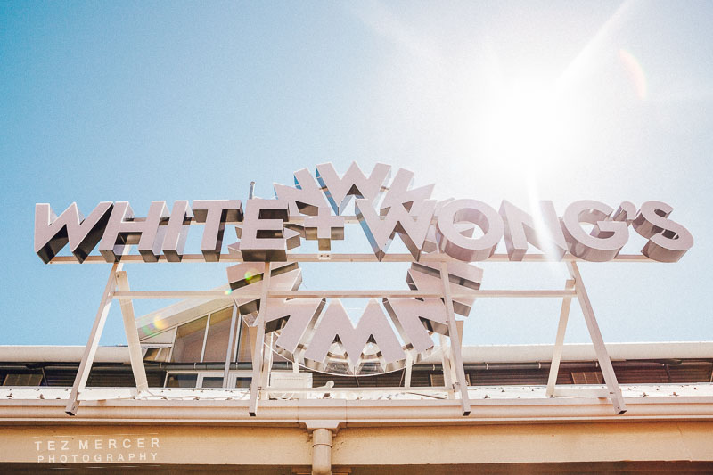
So there’s a new place opened on the Viaduct, the region of Auckland renowned for high-end eateries, buzzing nightlife, and daring cuisine. This new place is called White & Wongs, it’s where the maritime museum used to be (they moved around the corner). They’ve done a wonderful job with the interior – it’s plush, opulent, spacious, comfortable, welcoming, and that view just pulls you through like a giant magnet. Amazing to think the maritime museum had this all to themselves for years.
I was asked to come in and shoot the food, the venue, service, chefs cheffing, waiters waiting, the whole shebang. It was a lot of fun.
For this shoot I wanted to use a warm colour palette. I’ve spoken about white balance and colour choice before but look at these shots, then imagine if they were tinted blue or colder. The whole thing would look less inviting, smaller, darker, unfriendly, and basically everything you don’t want in a restaurant or commercial space. Because of this choice I set the white balance in camera to 6200k, which is pretty hot (too hot for skin tones) but gives a warm orangey tint to whites and leans the whole image to a warmer range of colours.


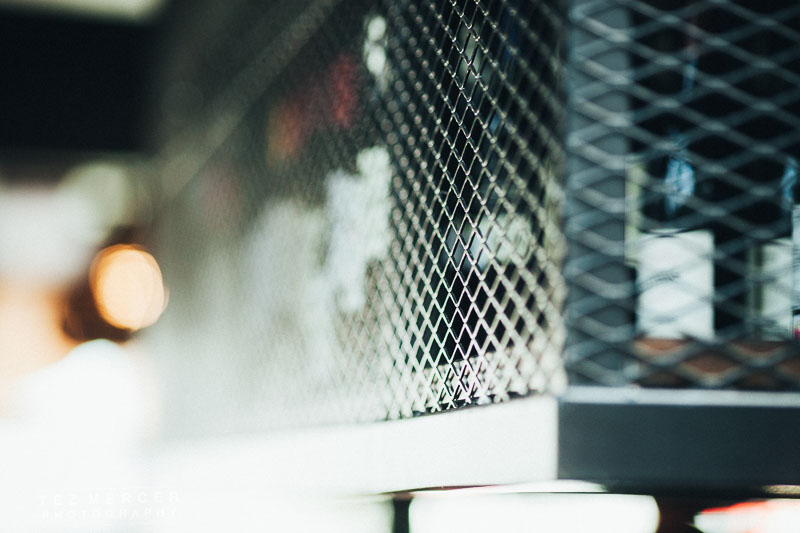
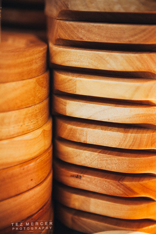
In most restaurants a lot of people have gone to a lot of effort to make the place look inviting and also thematically consistent throughout. Details like the cushions, glassware, plate size/shape, door handles, fork handles… everything has been chosen specifically for that venue and vibe so on every shoot like this I like to take a few minutes to just walk around and see what draws the eye, what details can be seen and use them. It’s one of those times when as a photographer you just need to trust yourself, if something catches your eye then ask yourself why, what made you stop. Is it the colour? The lines? The shape? How it interacts with other objects around it? Shoot it. The worst that happens is the client never sees it and you learn something from it, the best thing is you send it to the client and they think you’re great for taking the time to showcase their hard work.
Stuff like this:
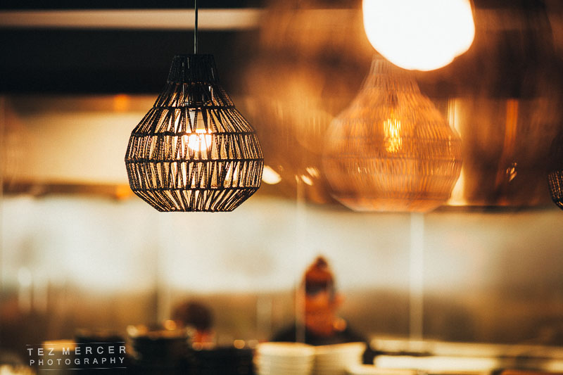
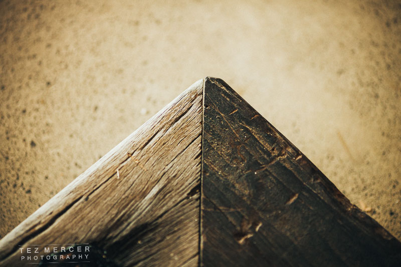
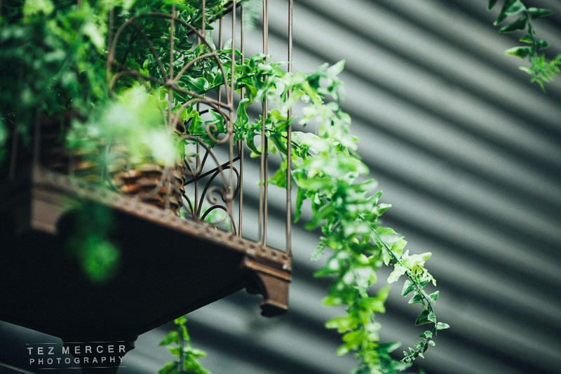


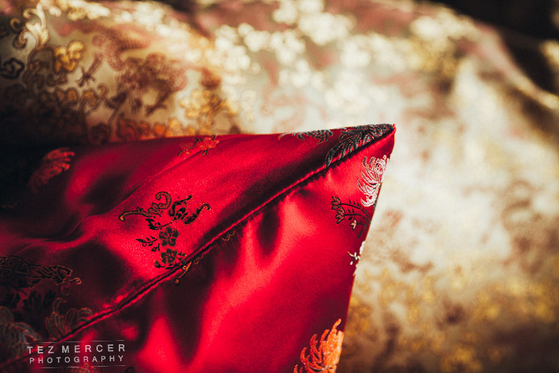
Showcasing the interior design and also, in this instance, the old-meets-new with the old rustic wooden steps that lead onto a newly laid and gleaming floor. And things like the lampshades, cushions fabrics, and contrasts between materials used. It’s also with things like this we can begin to build a textural palette of a space too. That might be the most pretentious sentence I’ve ever typed on this blog.
From my perspective I include these kind of shots so a client has the option of using them as filler images, or in a web gallery. I don’t expect them to function as hero images by themselves, or people to go “wow, what a great cushion!” and immediately book a table but they add depth to the narrative of what a space is and what the vibe is like within. You’re setting the scene a bit more than just throwing up a shot of the main dining area (which of course you need), such as this:

That shot was a total bitch to shoot. It’s midday on a glorious summers day, the sun is streaming in yet inside is kept subdued and cozy where the lights are dim. This means you’re shooting a massively contrasty scene. You can see the shadows near the bottom edges of the windows and where I’m standing taking this pic is pitch black on camera compared to the outside. This ability to show the huge extremes from pitch black to blinding sunlight is called dynamic range, and you need to maximise that dynamic range to include all the tones in an image. There’s a few ways – you can take images at different exposures and stack them together – but what I did here was shoot at the lowest contrast possible, expose for the highlights outside, then in post-processing bring up the shadows and exposure of the inside only to equalise the image. It’s not as complicated as it sounds. Basically point the camera outside, take a note of the exposure settings needed to get it around +1 or +1 1/3. Then switch to manual and tweak those settings while you’re shooting the room. After 3 attempts and chimping the histogram you’ll have it locked in where the dynamic range is big enough to show everything you’re shooting. Camera sensors are very smart but they still haven’t figured this out yet.
People come to restaurants for the food. It looks like this:


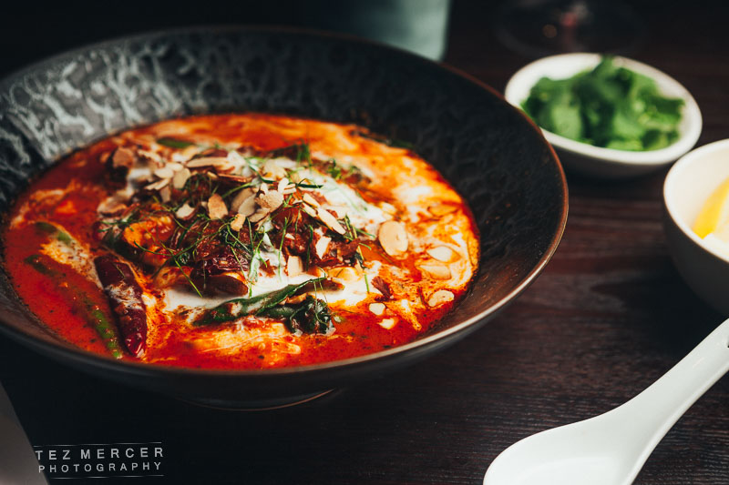
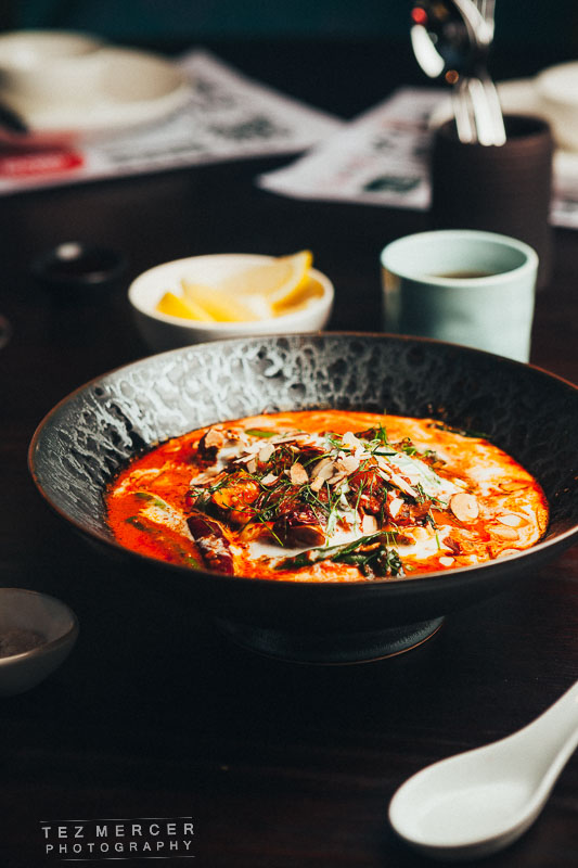
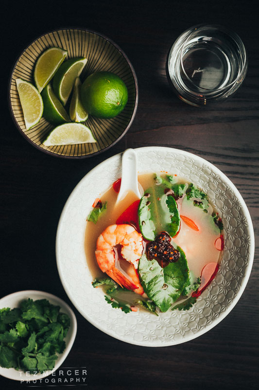


These were lit with a softbox from camera left or right and a reflector on the other side to kick some light back into the frame. I wanted to keep it luxurious, let the colours in the dish pop and hopefully compose it where the eye is drawn to the main plate whether through colour or leading lines. I know there’s some duplicates in there but it’s imperative to provide some options. I’ve no idea if a website will email asking if they have a landscape photo, or a portrait image, or whatever fits in their spread, so you’ve got to cover the bases and shoot the same thing in a few different ways in case they come looking for it. Again, the white balance is set to 6200k to really warm up the colours. It helps to make food look vibrant and fresh. If you set the white balance to auto in post it’ll make everything look very blue and grim. You don’t want that and if I was eating somewhere I wouldn’t want that either.
The light was about 3 ft away, and set for aperture f/4 at ISO 160 and around 200th of a second shutter speed. Since my strobe is lighting the entire scene I don’t need a slower shutter speed to bring in any ambient light, like if I was shooting at 1/50 of a second the natural light would start coming through. Not always a bad thing but if it’s from a light source with a different colour temperature (fluorescent lights for example) then that becomes a whole new ballgame of balancing kelvins and I’d rather not go into that, or deal with it unnecessarily so I don’t and the softbox takes care of everything.
I try and shoot food as long as I can in the space available. You get the background compression and the depth of field by shooting things long. Shoot wide and the scene distorts, the dishes look tiny and you start introducing distortion and curvature. Not good. These were all at 70mm which is plenty long when you’re standing on a chair trying to compose a shot on the table. Also, the angle I tend to go for is ‘diner angle’, that is the same angle at which you’d see the food if it were being served and you were sitting there waiting for it.
3 things to help you out with food/kitchen photography:
1- Everyone is called Chef in the kitchen. Call everyone Chef and you’ll be fine. It’s a sign of respect as well as being useful if you don’t know names.
2- If you’re in a kitchen shooting, communicate what you’re doing and where you’re going. Say “coming behind” if you’re passing behind someone so they don’t turn and pour something onto you and potentially waste a dish, say “over your shoulder” if you’re shooting over their shoulder. Be clear and be concise. Don’t explain why, just say what you’re doing clearly. I’ve seen photographers get in the way, get bumped into, knock plates, be very close to knives, and general myopia. Don’t mess with the guys at work, show respect and you’ll be welcomed back.
It’s their domain.
3- Ask Chef if there’s a presentation side to the dish. That’s the side they want the customer to see when the dish is set down in front of them and they usually have an insight into what they want to showcase. You don’t have to take their advice, but ask for it because you never know. It also shows respect to Chef that you’re asking for their opinion and input into the process.
—
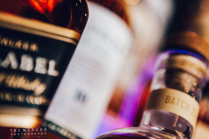
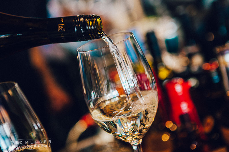
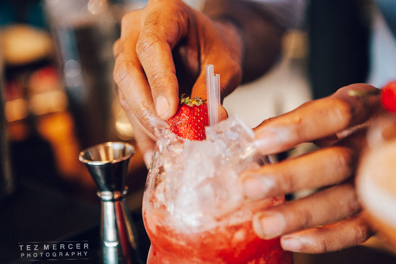
I also shot some of the cocktails from Sardine, the cocktail bar next door. Also some detail shots and the bar manager himself. Names to faces and all that.
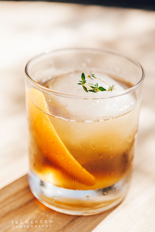
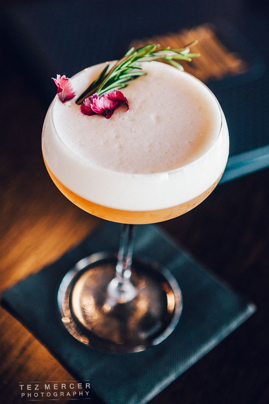
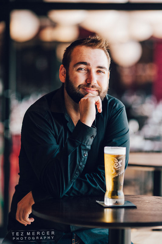
The portrait was shot with a 135mm lens, that’s why the background is so awesome. Everything else was shot at 70mm since the only 2 lenses I use 99% of the time are the 24-70 and the 135mm. I have others, some wider, some longer, some faster, but those 2 lenses are so awesome they’re the first things in the bag on every shoot unless I want a specific look.
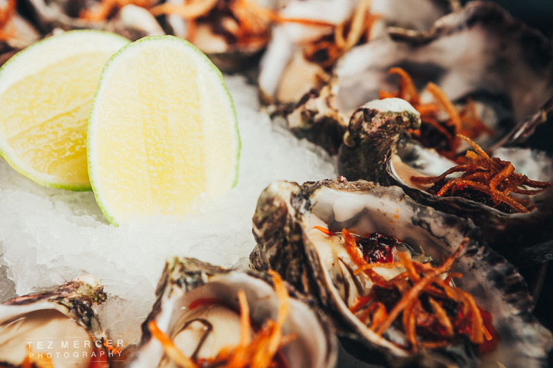
Here’s some more images of restauranty stuff.
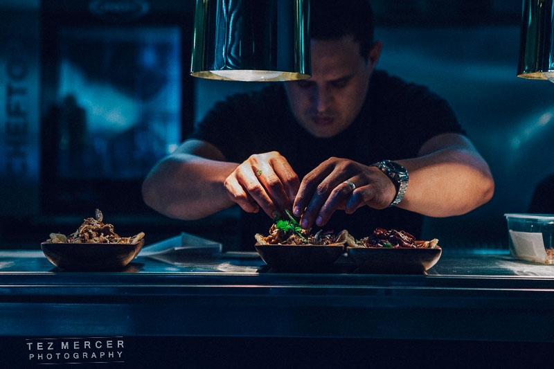
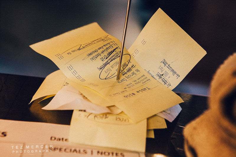
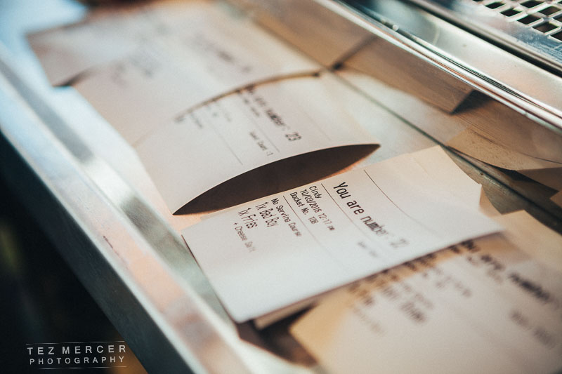


That’s a guy chopping stuff btw. More miscellany but this time I wanted a hands on feel of a restaurant in flow, so that’s drinks being poured, smiling diners celebrating, Chef asking for service, that kinda thing. Something with a bit more motion about it. The checks is something I always like to photograph because I think it looks cool and if people see a busy stack they know the kitchen’s busy, and if the kitchen’s busy then the restaurant’s busy, and if the restaurant’s busy it must be busy for a reason.
And I think that’s about it. Over 2 days I ended up submitting around 350 images to the client across 3 different venues and menus. They were long days, with a lot of ground to cover but it was all good work and the staff at these venues are great so they have my thanks for their patience and respect and not asking why I needed another bowl of limes, or not minding when I ask if I could could have a black ramekin and not a white one, please?
Hopefully that was helpful!
Cheers.
tez