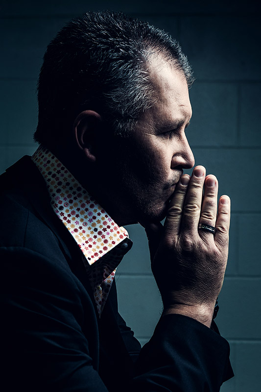
When a firetruck screams by you on the road, where are they going? The guys on board, who are they? After they’ve done what needed to be done, what do they do then? What made these people become the firefighters they are?
I spent a day at Silverdale Fire Station trying to find answers to these questions and to hopefully uncover who these people are underneath the skellerup and the fireproof jackets. What I found was humbling, compelling, and left me with a great deal of respect that people like this are out there putting themselves in harm’s way so others don’t have to.
Here’s the published story. All images & words by Tez Mercer. Video by 2DudesProductions – Geoff Carlaw and Tez Mercer.
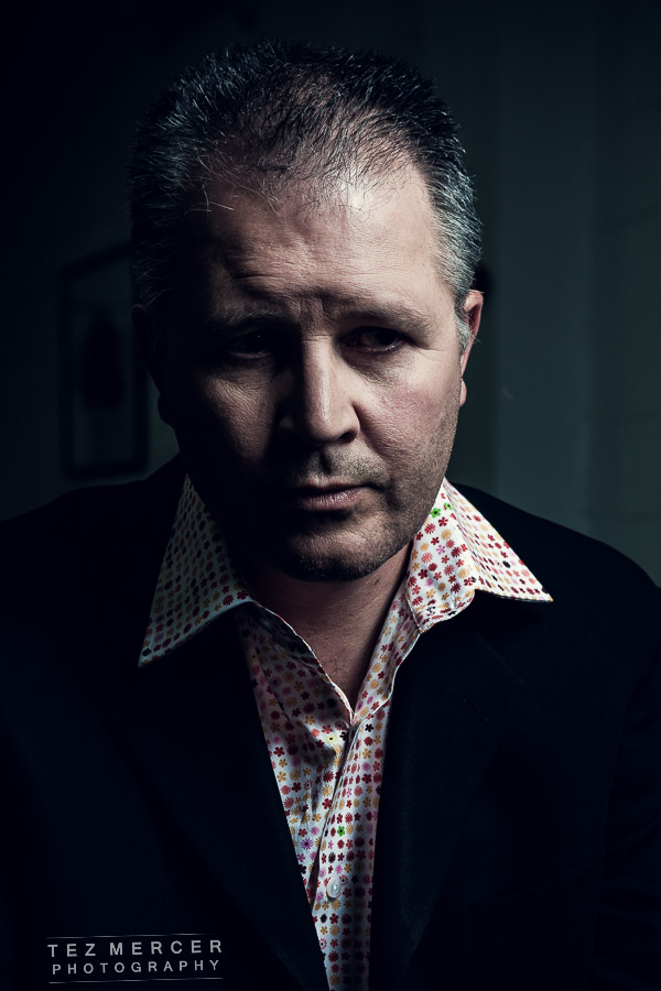
EVERYDAY HEROES:
“The call comes in. A siren woops across the quiet firehouse. The Scania fire truck rumbles into life and
sirens blaze. The call is for an MVA (motor vehicle accident) has occurred, a man is stranded and in peril.
The 4 firefighters at the Silverdale, Auckland station were in the truck quick as a flash, everyone in their
designated seats, every one focused, every one professional. 5 minutes before they were attending to
various tasks: Qualified Firefighter Kevin McCartney was refilling the breathing apparatus cylinders,
Qualified Firefighter Becky Wood was handling some paperwork, Senior Station Fire Officer Jake
Kennedy was on the phone and Senior Firefighter Dean Olsen was cleaning his gear.

“We’re like a coiled spring. When you go, you go, but when it’s quiet you’re alert, but relaxed”. says McCartney, a recent
addition to this station which is manned by 4 full-time firefighters and some 35 volunteers. “No point
burning yourself out trying to be alert all the time, you can’t do it”. On the truck it’s like watching a
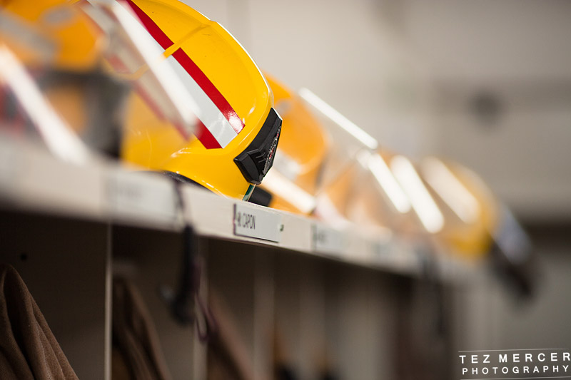
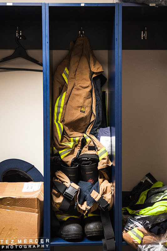
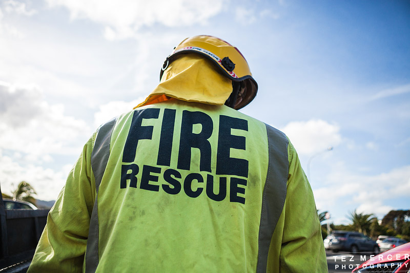
choreographed scene: the fire-retardant jackets come on effortlessly, marks of soot, ash and oil around
the FIRE RESCUE sign emblazoned large on the back. The gloves slide on, the overall trousers go over the
standard issue navy uniform and the impression is that they’ve done this 10,000 times and this is so
routine for these guys that they’re on autopilot. “How do you do that so fast?” I ask Olsen who’s seated
behind the driver, he just smiles at me as he’s pulling up his Skellerup boots as he listens to more
information crackling out of the radio up front.
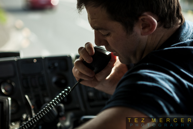
McCartney on the radio with dispatch
This type of call is regular. The actual putting out of fires is thankfully a slim minority in a firefighter’s
workload. As people become more educated about fire hazards and smoke alarms become more
prevalent, the outbreak of major fires is a lot less than it used to be- in 1985 there were 7 fatal-fire
injuries in NZ workplaces, in 1997 that number was zero. Senior Station Officer Jake Kennedy says that
the majority of a firefighter’s workload is out in the community checking smoke alarms, giving talks in
school educating kids on fire safety and on what to do in case of a fire, helping people who have had a
MVA; installing smoke alarms, liaising with NGOs to implement efficient and safe fire protocols in new
builds. “We’re a service, we’re part of the community and we’re here to help” he says.
Kennedy has been a fireman since the 1970s. He saw an ad proclaiming the NZFS as having the highest
job satisfaction rate of any job in the world, and based on that he signed up. And is it true?

Senior Station Officer Jake Kennedy
“Absolutely.This is the best job in the world” and what makes it so good? He gazes out the window thoughtfully for a
moment, turns back and says “there’s a bit in there about helping people you know? Being a people
person and wanting to assist other people when they’re in trouble. And then there’s the camaraderie,
I’ve never seen anything quite like it. There are the elements of excitement, but it’s always about
helping people”. These sentiments are echoed by the other full time staff at the station. Being a fire
fighter is not about the money, the glory, or the prestige, it’s about doing good for the community we’re
all a part of.
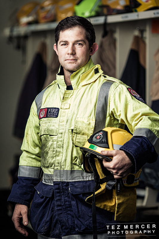
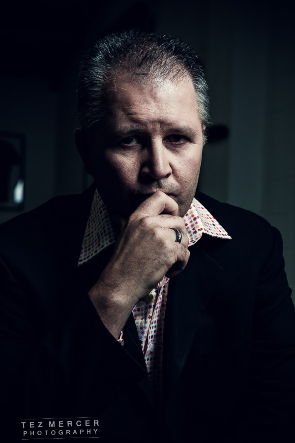
Firefighter Kevin McCartney
McCartney, who became a firefighter 3 years ago after serving in the NZ Army, says “I was
looking for something different, I couldn’t sit behind a desk all day. I need to be doing something… when
I joined the job I really enjoyed helping people and getting that satisfaction from helping people”.
Fire fighting is a profession that has changed dramatically over recent years and is shifting still. As fires
become less and less frequent through education and a more safety-conscious society the NZFS is
adapting their role to also become medical first responders to provide medical care until the paramedics
or ambulance crews can arrive.

Becky Wood, the youngest firefighter in the station at 27 is also a trained
medical responder: “I’ve been on more medical calls than anything else, and as we get better and better
trained there will probably be a lot more… We’ll turn up to jobs and the ambulance crews love us as we
can attend to the CPR and first aid while they attend to the more severe injuries”. Becky Wood is also
the only woman on the crew amidst a changing landscape in the Fire Service which is shaking off its old
stereotype of the ‘Old Boy’s Club’. McCartney explained the benefits of having a diverse workforce: “It’s
a great asset to have a woman on the crew as sometimes, women relate better to her than they do to
us.”

Senior Firefighter Dean Olsen
The NZFS has been undergoing a change in terms of its image to try and recruit more women, more
Maori, more Pacific Islanders, more Asian firemen to better represent the community. “Same for if
you’re Polynesian or Asian… we’ll go to someone’s house or workplace and their English might not be so
good. If you speak Mandarin or Korean or something you can get on their level straight away”. The old
stereotype is fading away to be replaced by a modern, progressive, and inclusive organisation: Kennedy
explains that “for many many years, the service was a male-dominated organisation, however back in
the 90s the Labour government were pushing for a more diverse workforce, across all the services, so
there was a push to recruit more women, Maori, Pacific Islanders and Asians. We now have more people
that can relate to communities better than ever before. We’ve become a lot more community-focused.”
As it stands today 10.4% of the NZFS are Maori, around 4% are Pacific Islanders and around 3% are
female. When compared to the 2001 figures of 5.3% Maori, 0.9% Pacific Islander and 0.9% female it’s
clear to see the landscape is definitely changing as the Fire Service stakes its claim at being a leader in
recruitment processes and recruiting from all parts of the community. The recruitment procedure to join
as a firefighter is involved to say the least. Whereas in an everyday employment interview an applicant
would sit with HR, answer questions about their work history and go through the “tell me 3 things about
yourself” routine, the NZFS adopts a multi-faceted approach to recruitment which can take months to
not only test whether an applicant can do the physical work but whether they can function in a group,
take orders, adapt, and spend time in an enclosed space (the fire station) with the same people.

The road to being a firefighter begins with an online application, then there’s a cognitive ability test,
then a physical test ; followed by a practical assessment course. After that comes the formal interview,
followed by medical and security checks. The formal interview is more situational than directly related
to the procedures of fighting a fire. Instead of asking “what would you do if there was a fire in an oil
pan?” the questions are more along the lines of “after a fire is extinguished, a Samoan man is distraught.
What would you do?” questions like this capture applicants off guard and also test how they react to
new information, or unexpected turns of events, which on a call could occur at any second. This also
highlights the awareness possessed by the NZFS of its role and place in a community, it sits within it, not
outside it. Once an applicant has been accepted through the testing phase there is a 12 week
training course in Rotorua before going on a 12 month probationary period. This long amount of time
spent working and training engenders a camaraderie and a strong sense of trust between the
firefighters in a crew: “Your crew are your safety. There’s a huge amount of trust… you have to trust that
the other guy’s going to be there. We all buy into it and live up to that trust.” says McCartney. Kennedy
puts another slant on it: “it isn’t just the trust on the calls, it’s trusting them with your life and your
problems. If someone is going through a personal problem, there’s people who will listen and who will
understand”.
Spending time with the crew provides a tangible sense of the trust and friendship between the members
and garners a profound respect for these people who selflessly serve the community by helping others.
They don’t receive any special praise and sometimes it’s a thankless job as the men and women of the
NZFS are taken for granted. With that in mind there are a few things we can all do that would not only
make their jobs easier, but could potentially save lives when they’re on the line.
“Obviously, we need to get somewhere quick. If a house is burning down, or if you’re trapped in your car then every second
counts. If you see the big red truck bearing down on you, pull over to the left and let us pass, that’s all
we ask” McCartney explained. Another simple thing to do is to regularly test the smoke alarms in your
home and keep them operational and uncovered: “we’ve seen them with plates taped over them or
with batteries removed because it woke someone up once. You’ve got to test they’re working at least
once a month”. In 2 minutes a fire can go from an ember in a grill pan to engulfing a house. The adverts
on TV aren’t sensationalised and there’s a real need to be diligent and responsible around fire and fire
safety to keep you and your family safe.”


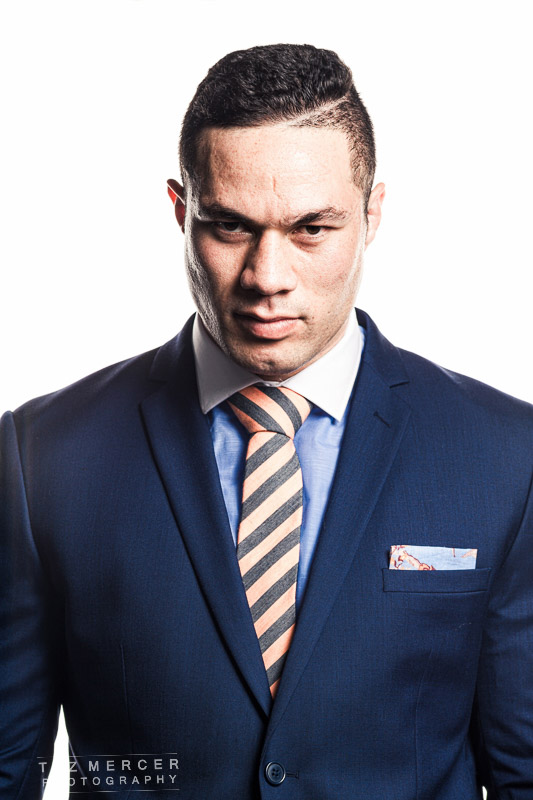
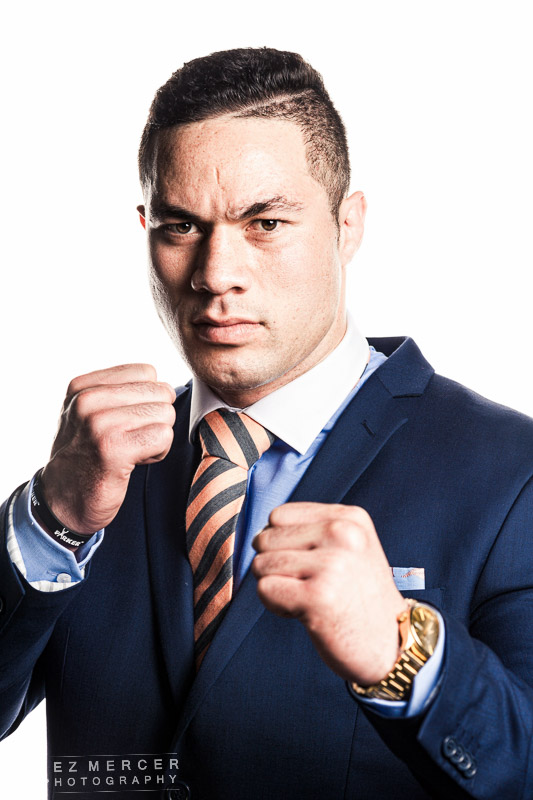
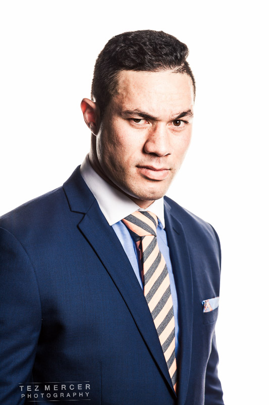
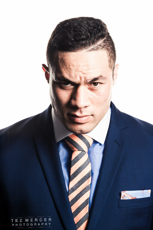
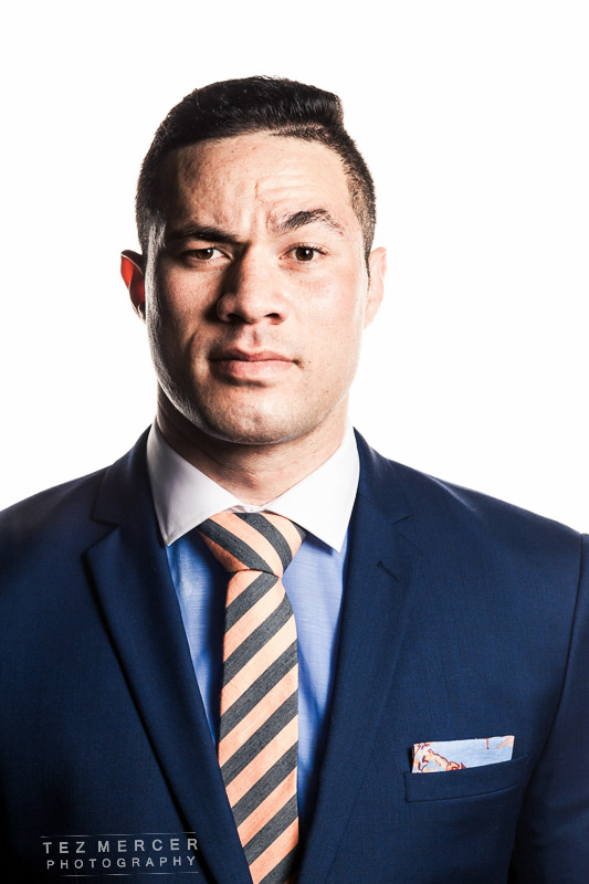


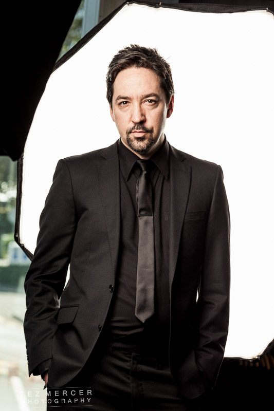
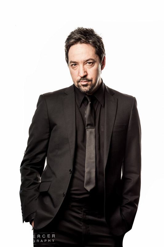
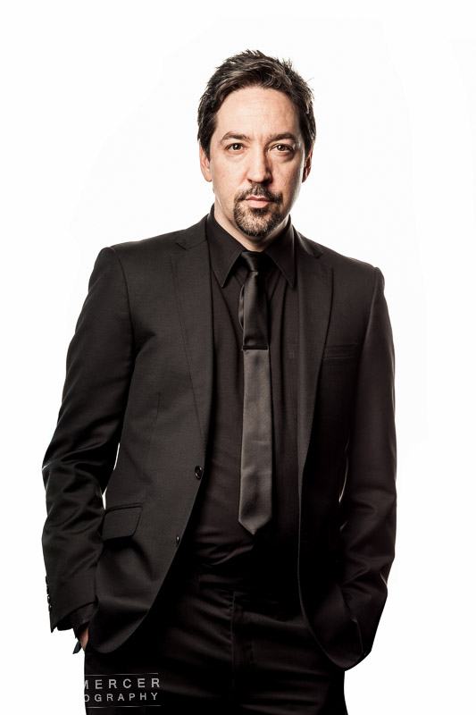
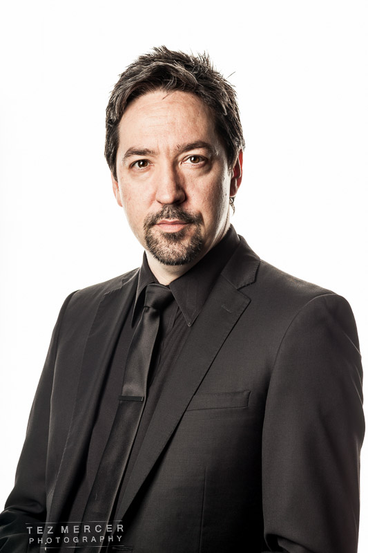
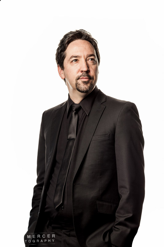
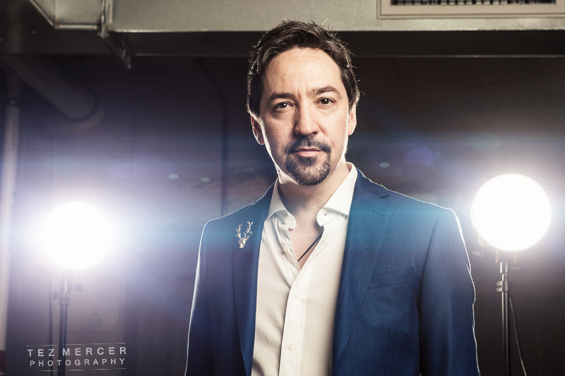
 Corbett’s time in front of the light which was whited out completely in post.
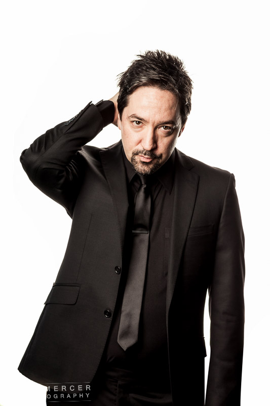