I didn’t think it was his real name, or at least spelled that way. Jon Toogood is a bona fide rockstar. His band, Shihad, have shared the stage with behemoths of the rock and metal world including superstars like Metallica and Black Sabbath, ever since their arrival on the scene with Churn in 1993. 5 number 1 albums to their name, multiple world tours… suffice to say that Shihad are pretty big.
For some reason I was the guy commissioned to photograph Jon Toogood while he was over in Auckland for a few solo shows. The photos were going to be for a 10 page spread in a national magazine covering the man and his career. An important gig.
The styling was handled by the lovely and effervescent Mike at NZ Suit Source (http://www.suitsource.co.nz/) who always does a stellar job of making people look awesome and he’s got a very useful grasp of complimentary colours, shapes, cuts of lapels, and conveniently has access to all manner of props. Cheers, Mike!
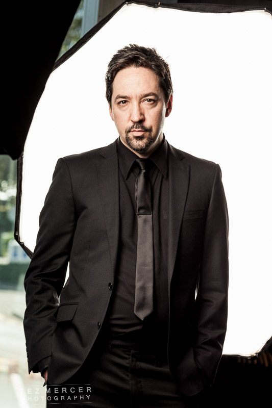
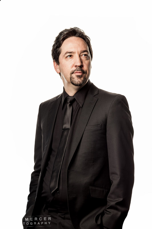
If you read my Taika Waititi article recently this might look familiar: white background, guy in suit, softbox around the front. The white background is an octabox so it’s a light itself. It’s advantageous not only because it’s guaranteed to actually be 100% white but because it lights the back of the subject and has a wonderful wraparound glow that just seeps through the edges. The light round the front is a softbox pointed slightly down and around to the camera right. If this light is in front it looks just like a passport photo, which you might want but you probably don’t. Then it’s up to the camera-wielder to do the good ol’ direction so the subject knows what’s going on.
I was thinking about this the other day, that on photo courses you get taught a lot of the mechanics such as apertures and focal lengths, talks about hyperfocal distances and lighting ratios, but I’ve not come across one that addresses the issue of actually talking to the person on the other side of the camera and it’s like 75% of the shoot because, after all, if the person isn’t happy with you pointing a camera at them, or feels uncomfortable, the work is going to suffer. Lighting is cause and effect but direction is a bit different. It’s a habit of mine that the first time I meet someone I’m shooting, there are no cameras or lighting gear anywhere, it’s just 2 people chatting about whatever (music in this case). This way it’s just Tez talking to Jon, or Tez talking to whoever, which is a much more comfortable dynamic than photographer/subject, or photographer/client, and it also gives you the chance to establish a little bit of a rapport before the lights go up.
Before editing the shots look like this. See how the octa lights the right (our right) side of his cheek? That’s what I’m looking for. The editing then is basically a matter of painting white around the edges and watching the lines of the suit but masking that stuff out is way way way easier than masking around someone’s hair! If you want to test your patience, give that a go, it’s great.
And with the edits and some variations of pose:
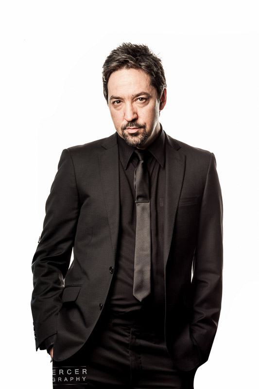
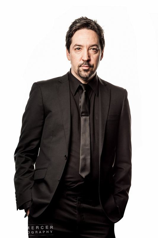
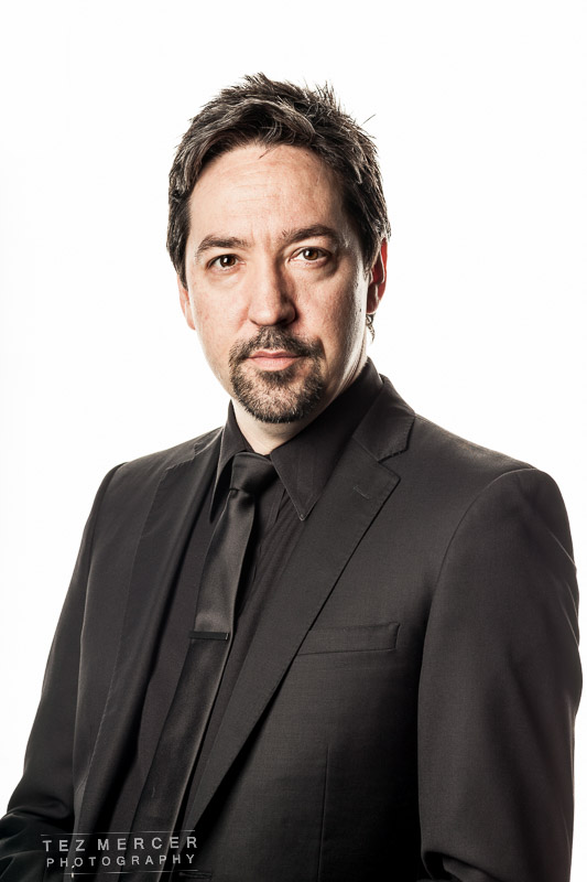
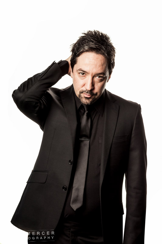
There’s a lot more but you get the idea. In between every shot I asked Jon if he could move his head or his chin, or look somewhere around the store, and turn his shoulders this way and that. It just gives some variety to the shots and gives options to the layout guys at the publication since it’s very rare that I have any idea about headlines, lead-ins, text placement etc before the shoot happens.
I think I had about 90 minutes for 10 pages and 3 changeouts of clothing. I’ve done more with less and it’s times like these when you’re not just taking pictures, you’re talking with stylists and tailors about looks, backgrounds, colours, styles, thoughts about what you’re looking for and what you’re not looking for. The photographer on these kind of shoots pretty much calls the shots. The subject/client always has veto but luckily Jon was cool with all the suggestions and seemed happy to stand in certain places looking cool and suave.
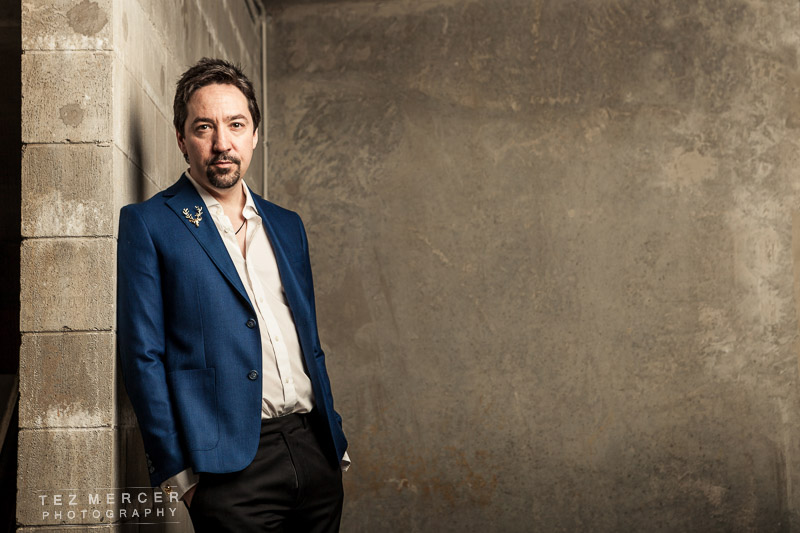
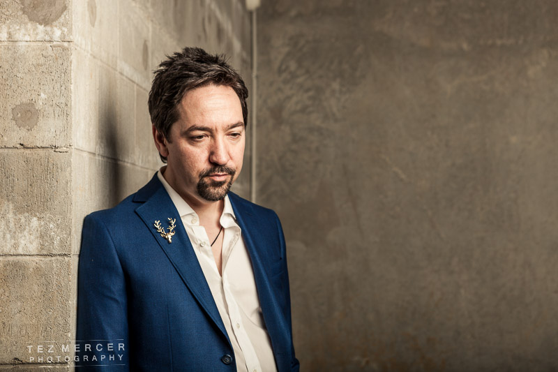
The next look I wanted something different, something in situ, not the typical rock n roll back-alley stuff, or a brick wall, but something a little more dystopian, maybe a little western, something… drier maybe, like arid landscapes, not caustic wit… of which I have none.
It looked something like this:
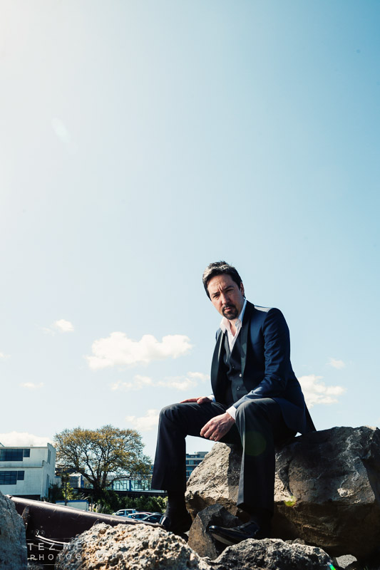
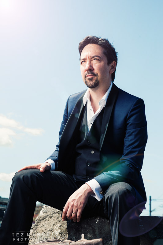
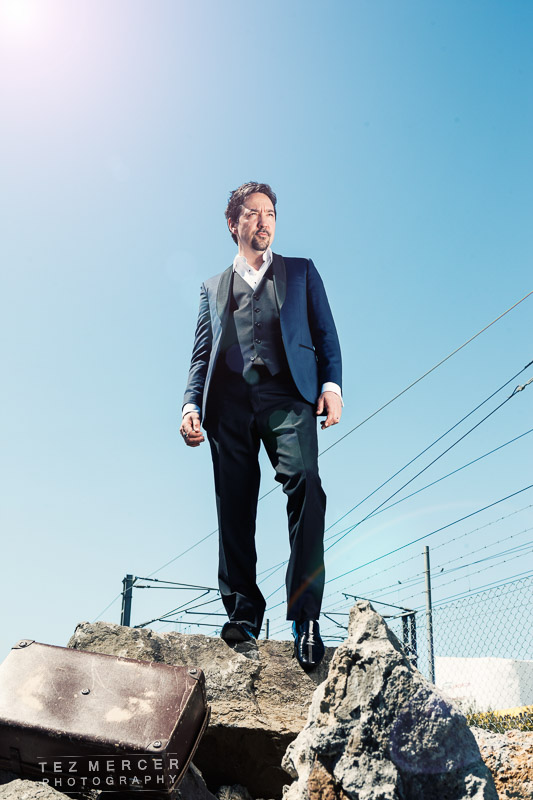
To me there’s a No Country for Old Men look going on there with the harsh sunlight. Which I should explain: I had a helping hand from the PR agent on this case who was holding a light to camera left, emphatically ensuring the whole light didn’t topple over on what was a very windy day. It’s just the massive octabox camera left, around 7ft high, and set to about 2/3 power to balance with the sun. I wanted it to look like the sun so the light was backed off a little which makes the dropoff (that’s the gradation from light to dark) much sharper. So now you know, it’s all in the lighting, folks. There’s another, far more practical reason for the lighting too: you can’t have someone squinting the entire shoot or damaging someone’s eyesight holding their eyes open under a glaring sun. This way the look was achieved with just the right amount of squintage and everybody kept their eyesight.
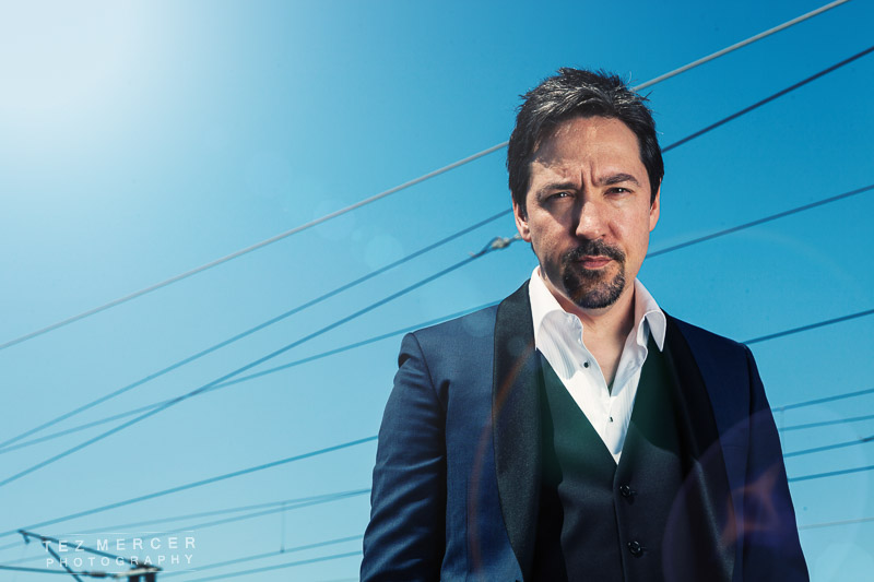
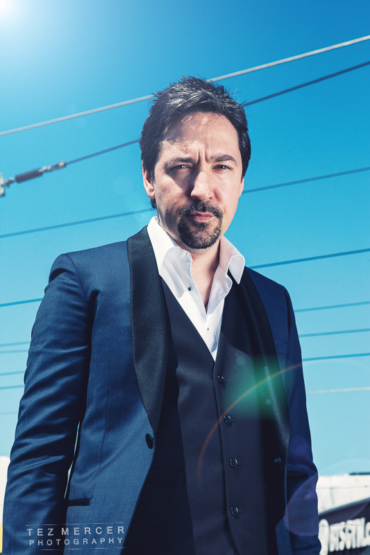
Way back when I wrote an article about white balance and how it can be used stylistically, something to do with the psychological effects of colour and split-toning (it’s been done in films for decades). It comes in here because I wanted a different colour palette between the shoots, not just in fabric and shirts but with the whole ensemble. The first set has a warm tint going on, and this second set has a colder blue tint going on where the shadows are tinted blue, so hopefully when the page is turned it’s a whole different feel and mood.
The awesome PR agent/account manager struck again on the third look to help me out with the white balance. I mentioned in another post the $2 grey card from AliExpress. It looks like this in action:
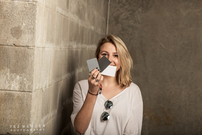
That’s the spectrum of luminosity (white to black) in an image. There’s 3 cards – one white, one black, and one middle grey. In post, click on the white or grey card there to obtain ‘perfect’ white balance. No tints, no purple skin, it should be neutralised. I generally start with the correct WB and then ignore it because I’m looking for a certain effect or tone in a shot which can be achieved through manipulating the WB further. But, this is the starting point for 99% of my images (when it’s convenient).
This is a car park btw. I have a thing for concrete and breezeblocks and have something like 2gb of shots of industrial things for use as textures/overlays.
Here’s the man himself:
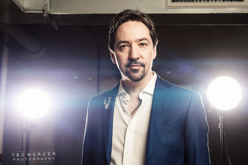
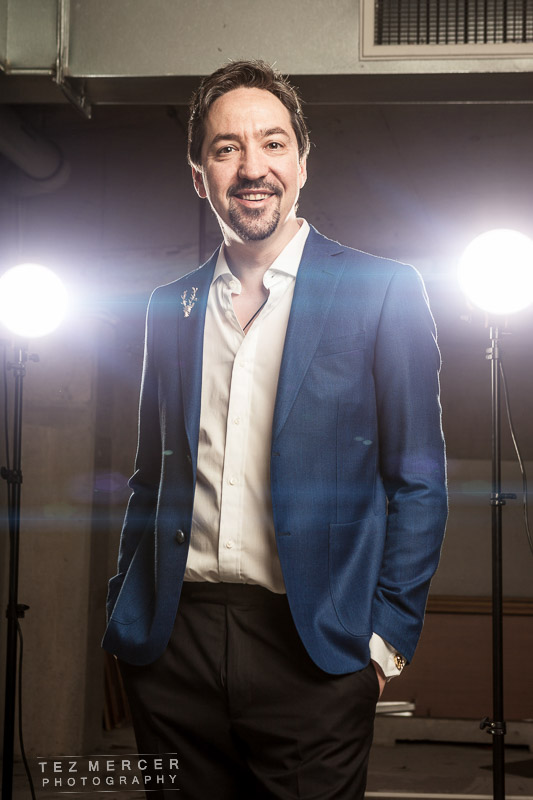 Get the lights out the way and the magazine can have some options for writing stuff:

And that’s about it. Obviously there were a lot more shots but variations on a theme rather than completely different looks since time was limited and the magazine definitely got enough to print and run a fully fleshed out article with a variety of looks, spreads, styles, colours, and moods. Job done.
Thanks to Jon Toogood for being a total legend and a gent, Mike for kicking ass, and Pead PR for sending a rep who was more than happy to get down and dirty to get the job done.